✕
The Nintendo Switch ships with a home screen designed for simplicity — but simplicity isn't the same as usability. This concept asks: what does the interface look like when it's built for how people actually use the device?
The Switch home screen was designed for the casual player with a handful of games. But that's not most Switch owners. Heavy users accumulate large libraries, use the device across multiple TVs, and increasingly rely on it for streaming — not just gaming.
The interface never adapted to this. Every game and every app lives in the same flat, unorganized row. There's no continuity between sessions, no hierarchy, and no acknowledgment that the Switch has become a media device as much as a gaming one. The result is an interface that gets harder to use the more you invest in the platform.
The goal of this concept wasn't to reinvent Nintendo's design language — it was to extend it. Keep what works (the clean aesthetic, the rounded cards, the lightweight feel) and fix what doesn't scale.
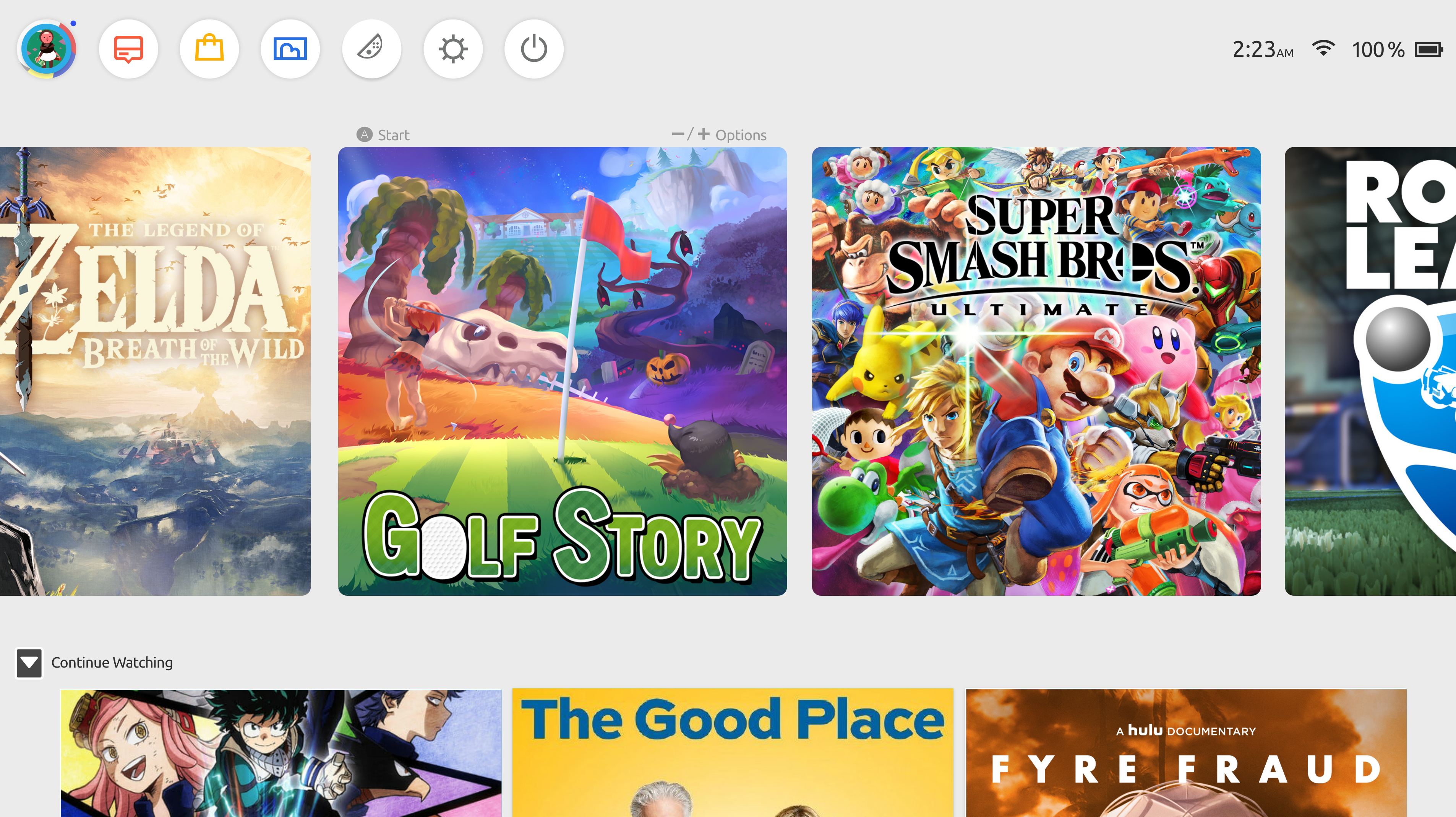
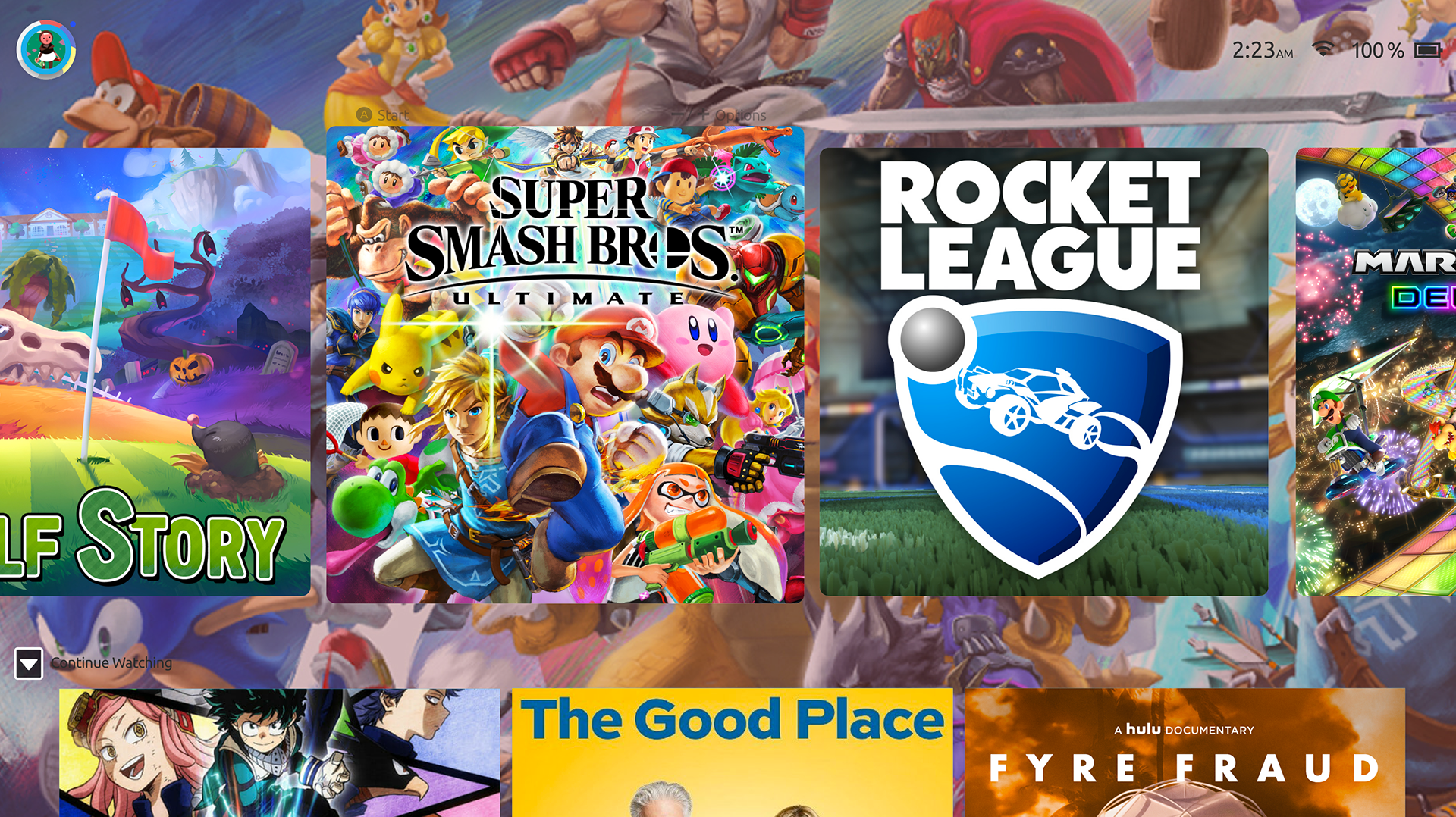
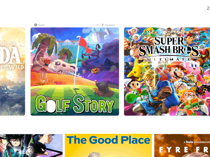
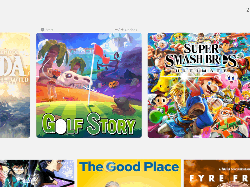
The original UI puts everything at the same level — games, apps, settings — with no visual hierarchy. The active game gets a slightly larger thumbnail, but that's the only signal of context. The grey background is neutral to the point of being blank.
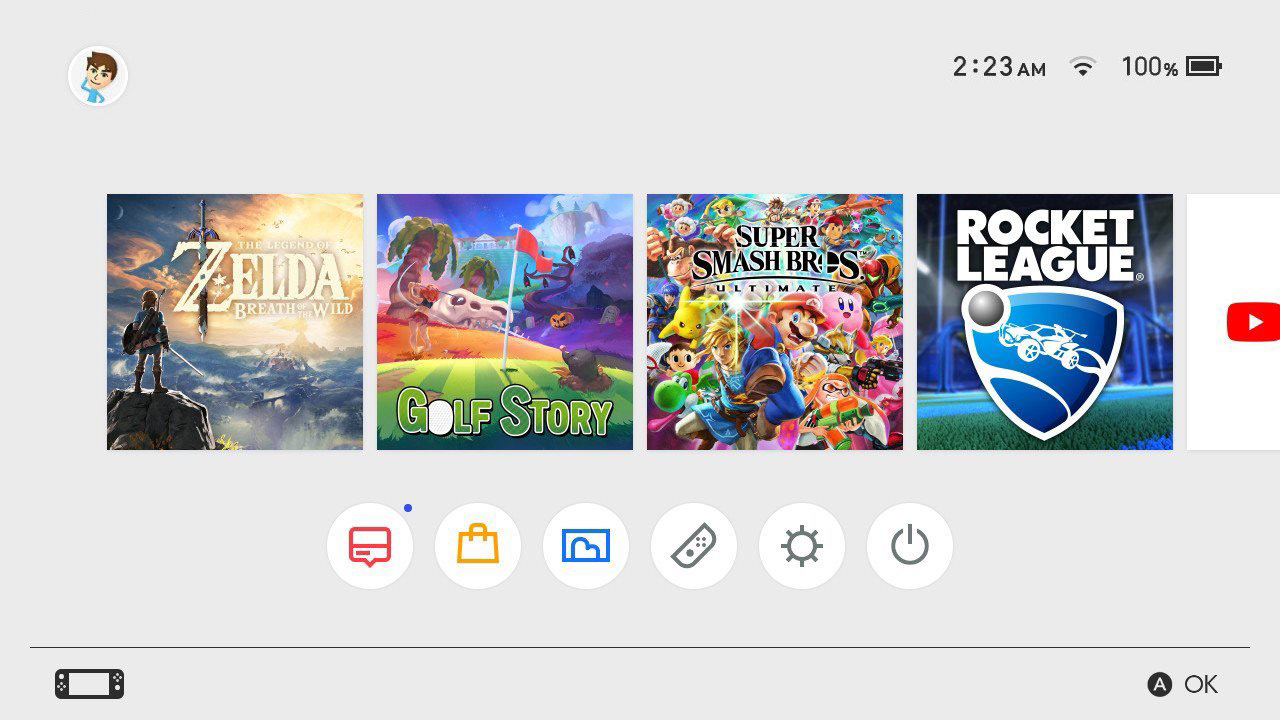
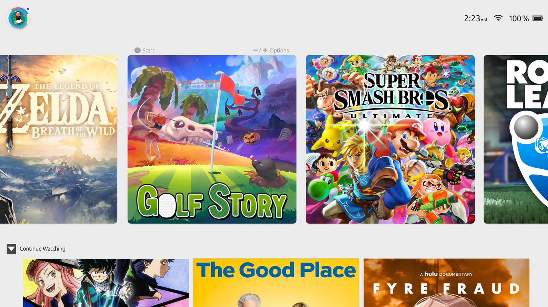
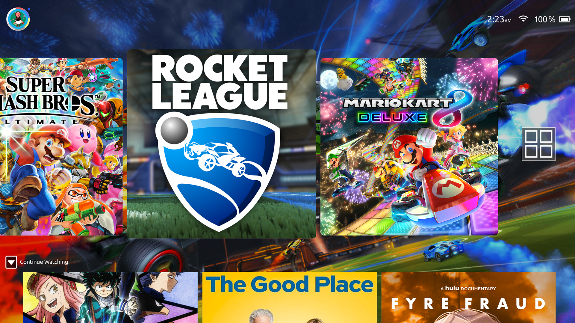
The redesign introduces hierarchy through scale and context. The focused game gets a full-bleed background treatment, making it clear what you're about to play. The navigation moves from a bottom dock — where it competes for space with game art — to a top bar that stays out of the way. And media content surfaces in a dedicated row below the game library, so switching between gaming and watching doesn't require hunting through an app list.
Every decision was made to work within controller navigation — no hover states, no precision clicking. The layout had to feel fast and readable at a distance, on a TV screen.
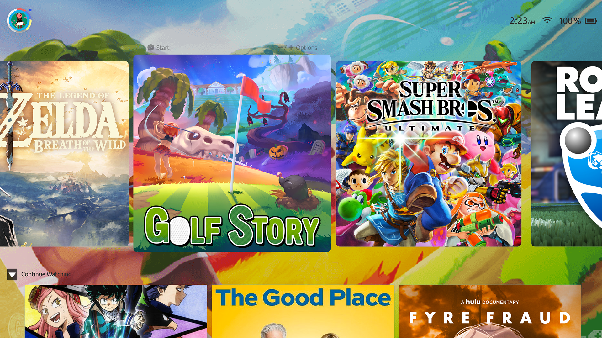
One of the clearest UX signals a home screen can give is context — telling you where you are and what you're about to do. The original Switch background gives you nothing. A static grey field that never changes regardless of what's selected.
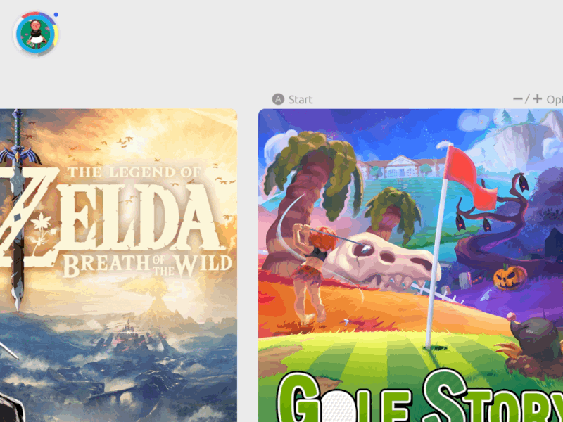
The dynamic wallpaper uses the game art you're already looking at as the background — blurred, scaled, and composited behind the UI. Scroll to Smash Bros and the screen fills with character art. Land on Golf Story and it goes warm and green. The background becomes ambient context rather than wasted space.
The key constraint was performance: wallpaper transitions had to be fast and not compete with the interface. The blur keeps it from clashing with foreground elements, and the transition is tied to the selection cursor so it feels responsive, not lagged.

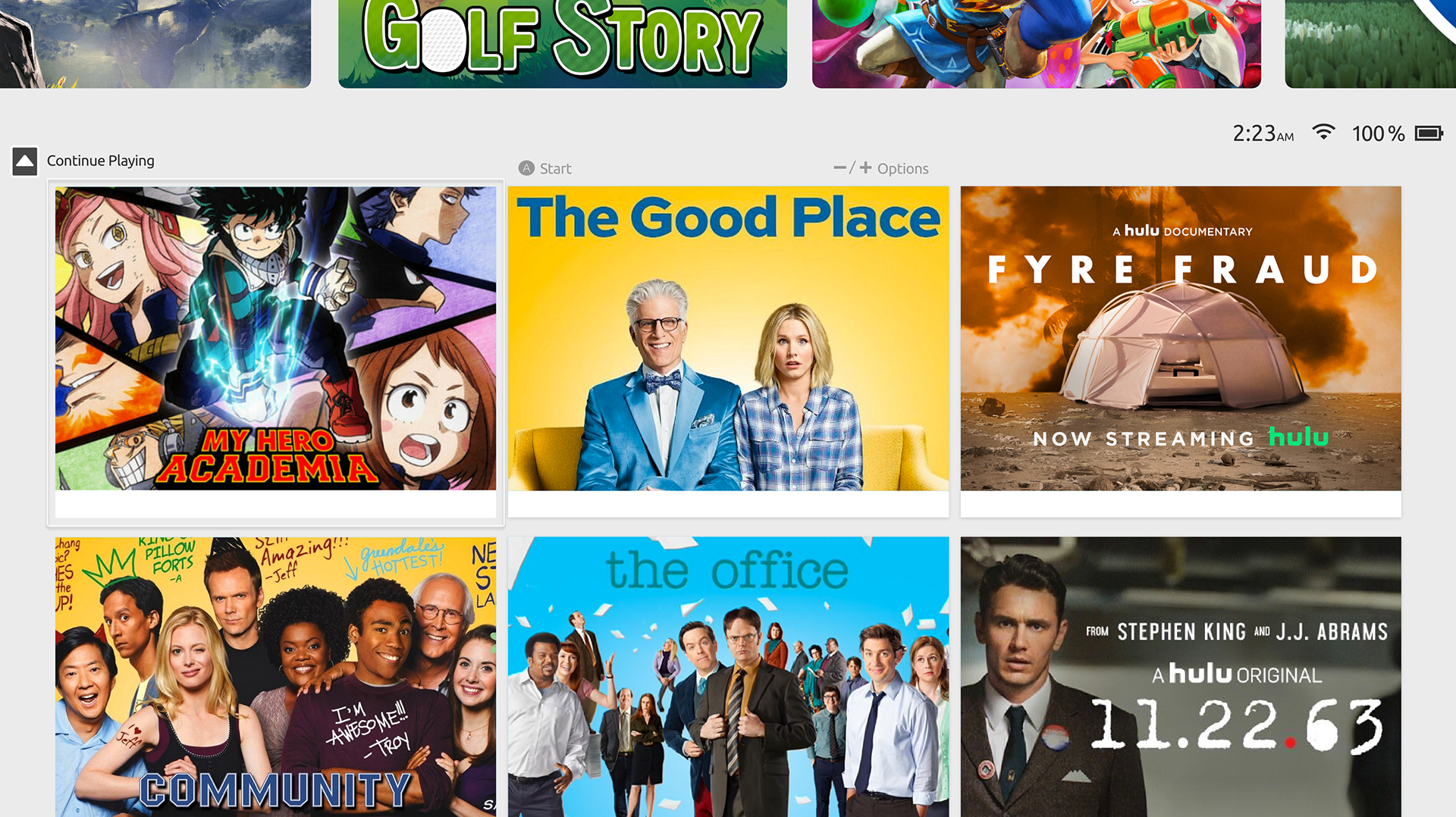
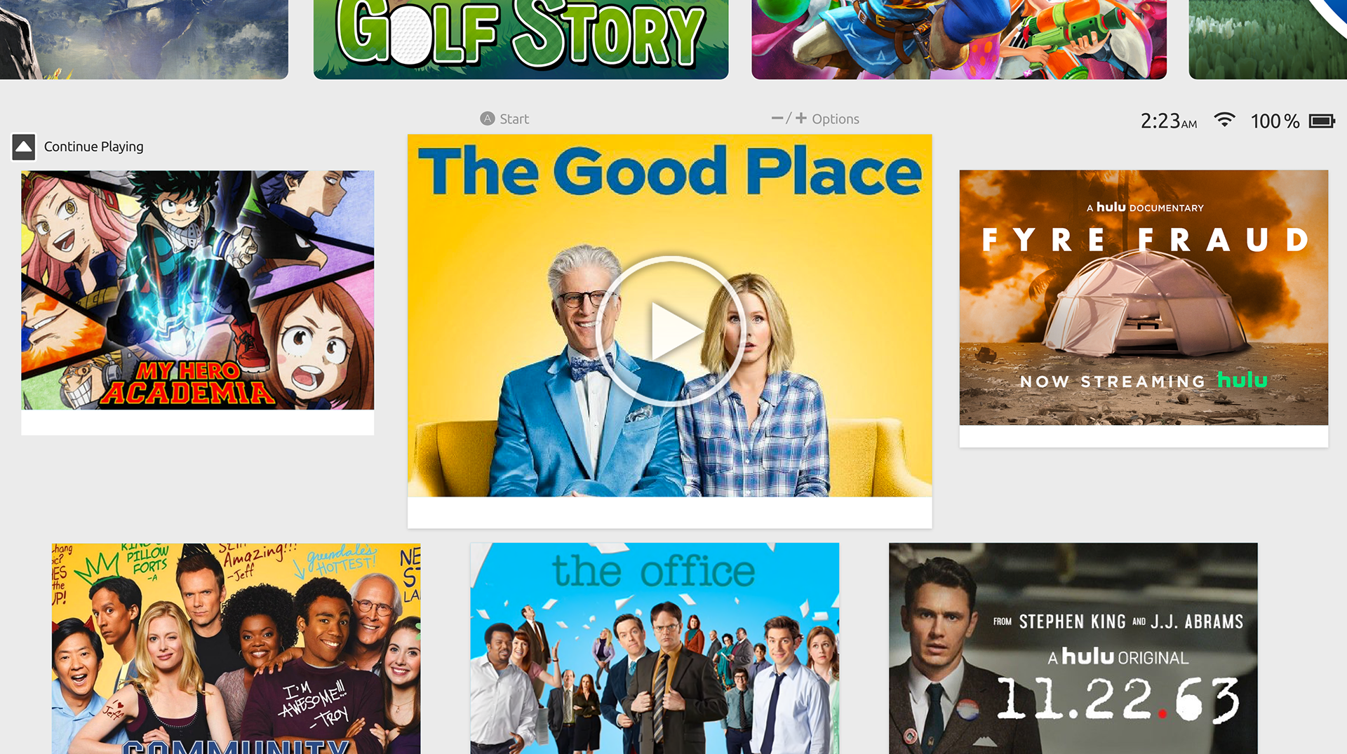
The Switch is portable, dockable, and already has Hulu and YouTube — yet the interface treats streaming as an afterthought buried in the app row. For users who watch TV on their Switch between gaming sessions, resuming a show requires: navigate to the app row, find the app, launch it, wait for it to load, find where you left off. That's too many steps for something people do constantly.
The Continue Playing row solves this by surfacing in-progress media directly on the home screen — same way games show a resume prompt. One button gets you back into your show. The grid layout was chosen to match the visual density of the existing Nintendo UI, keeping the aesthetic coherent rather than importing a Netflix-style interface that would feel foreign on the platform.
Animations were kept deliberately minimal throughout — the Switch's hardware isn't built for heavy UI effects, and slower transitions erode the feeling of responsiveness that makes a game console feel good to use.

This was a concept, not a shipped product — so it's worth being honest about what it doesn't solve. The dynamic wallpaper assumes Nintendo exposes game art as a system resource, which they currently don't. The media row assumes cross-app API access that would require platform-level support from streaming services.
The nav bar hiding by default is a UX tradeoff: reducing clutter for experienced users but potentially increasing discoverability friction for new ones. A real implementation would need onboarding or a persistent hint state.
If I were to revisit this today I'd also think harder about the library organization problem — a large game collection still doesn't have a good answer here, and something like folders, filters, or recency grouping would add meaningful usability for power users.
As you scroll through your game library, the background updates in real time — pulling artwork from whichever title is in focus. The transition is smooth and instant, making the home screen feel alive without adding visual noise.
Dynamic wallpaper — live background as you navigate
On the left, the full media selection flow — browsing the Continue Playing row and launching into a streaming app. On the right, the contextual menu bar: hidden by default since those options aren't accessed daily, it slides in when called and stays out of the way the rest of the time.
Media selection — browsing + app launch
Contextual menu bar — hidden until needed
This UI concept was picked up by designer Olivier Raymond and used as the screen interface for his Nintendo Switch UP Product Concept — a full hardware redesign imagining what a next-generation Switch could look like. Seeing the UI placed inside a physical device concept was a nice validation that the design language felt at home in the Nintendo ecosystem.


Nintendo Switch UP Concept by Olivier Raymond — Behance, 2019