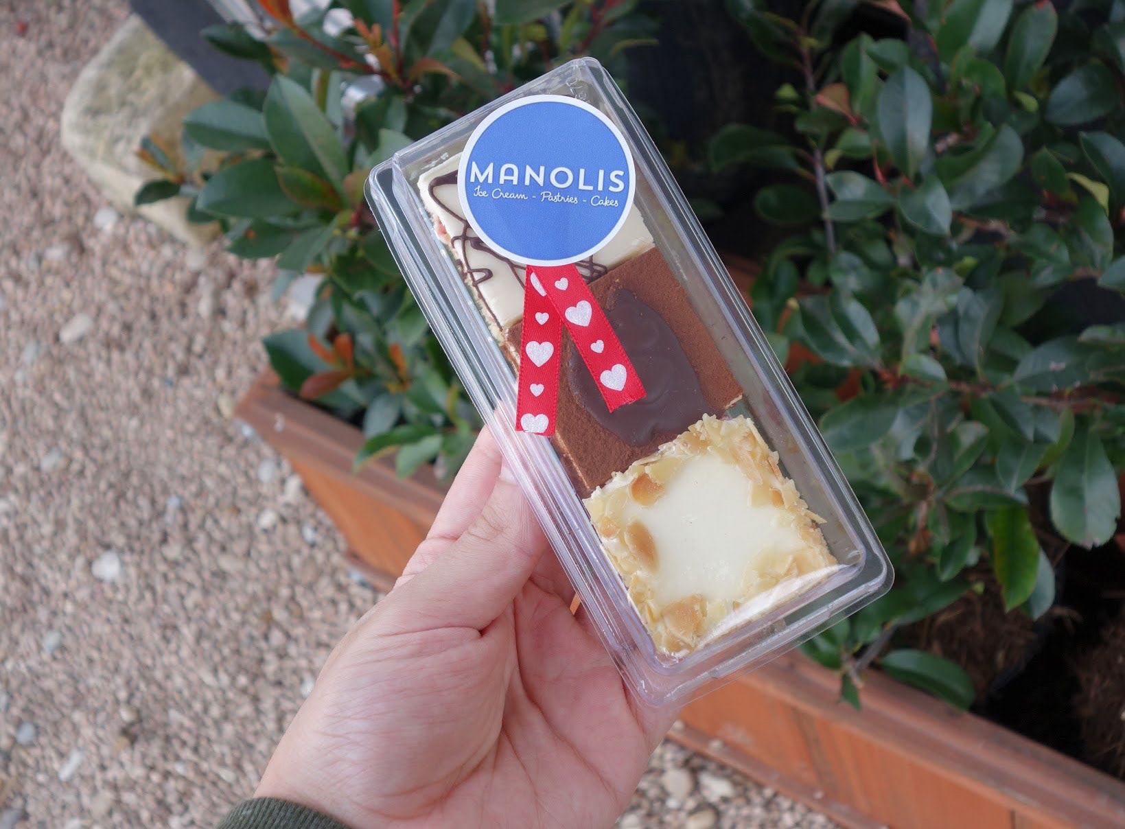
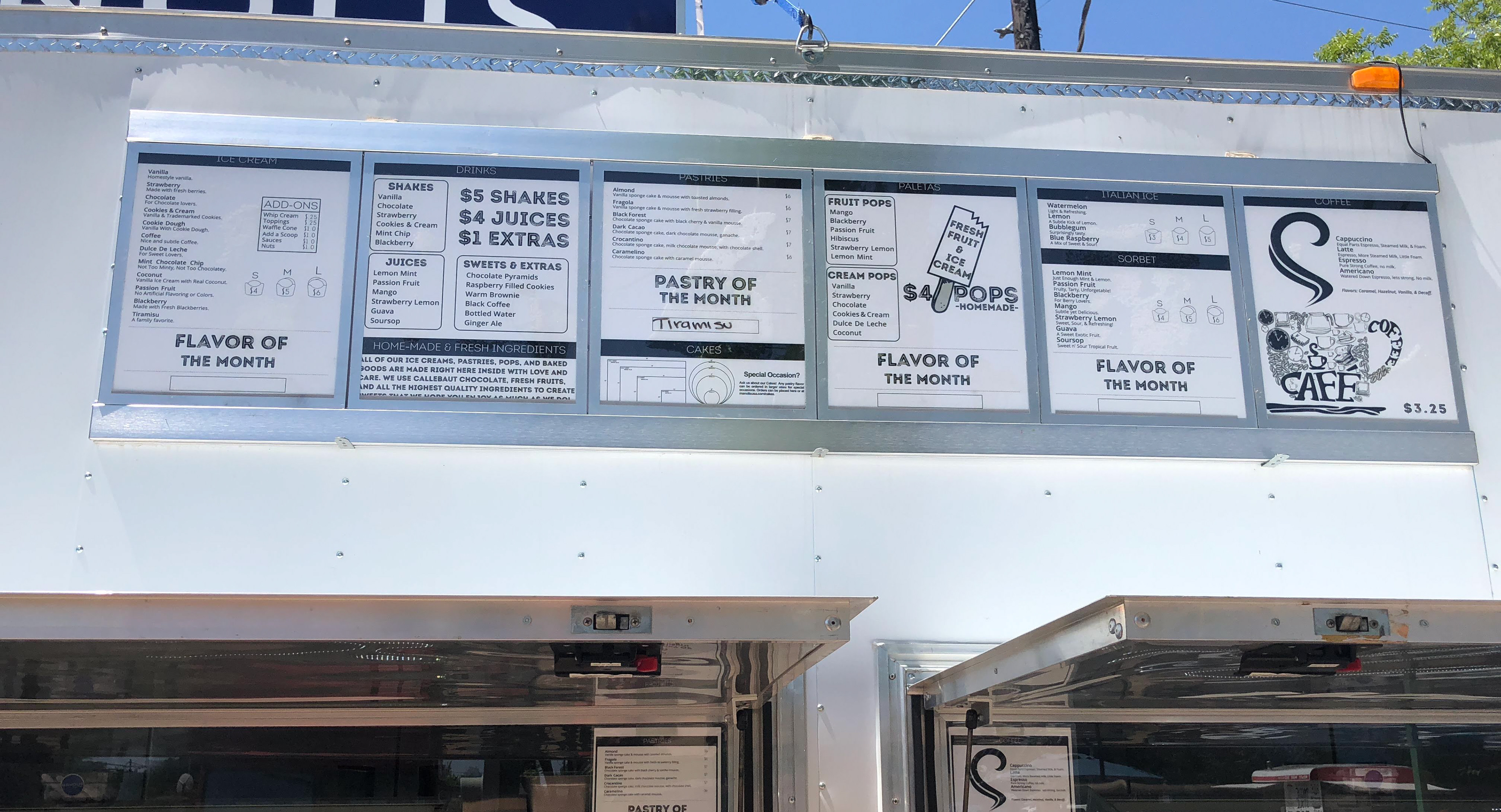
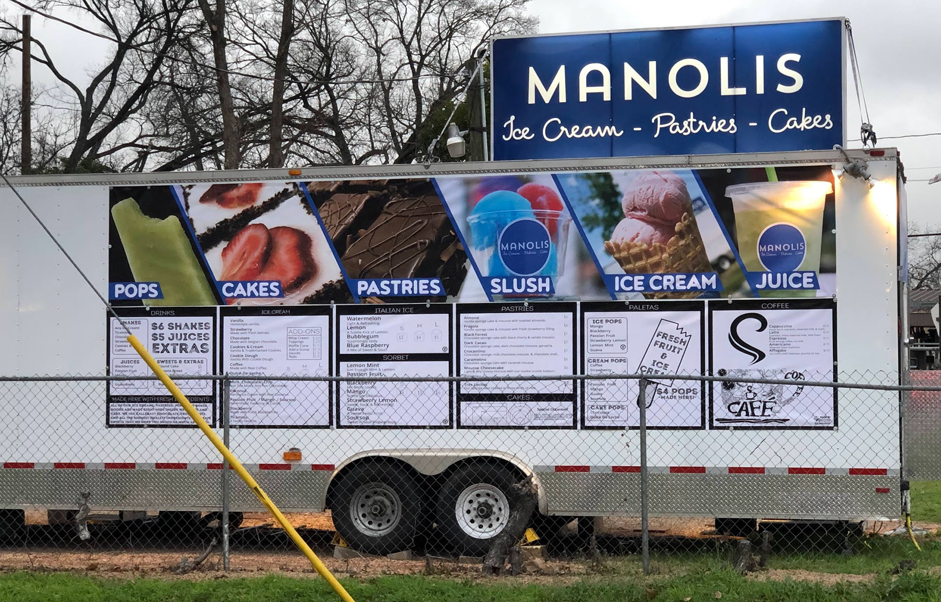
2026 menu system
The full refresh.
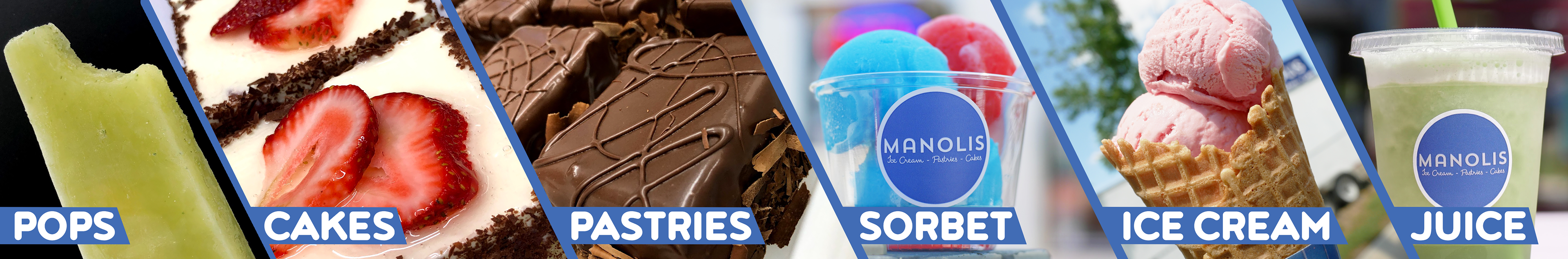
Full color. No pastries. Better hierarchy. Eight menus redesigned from scratch to match where the brand is now.
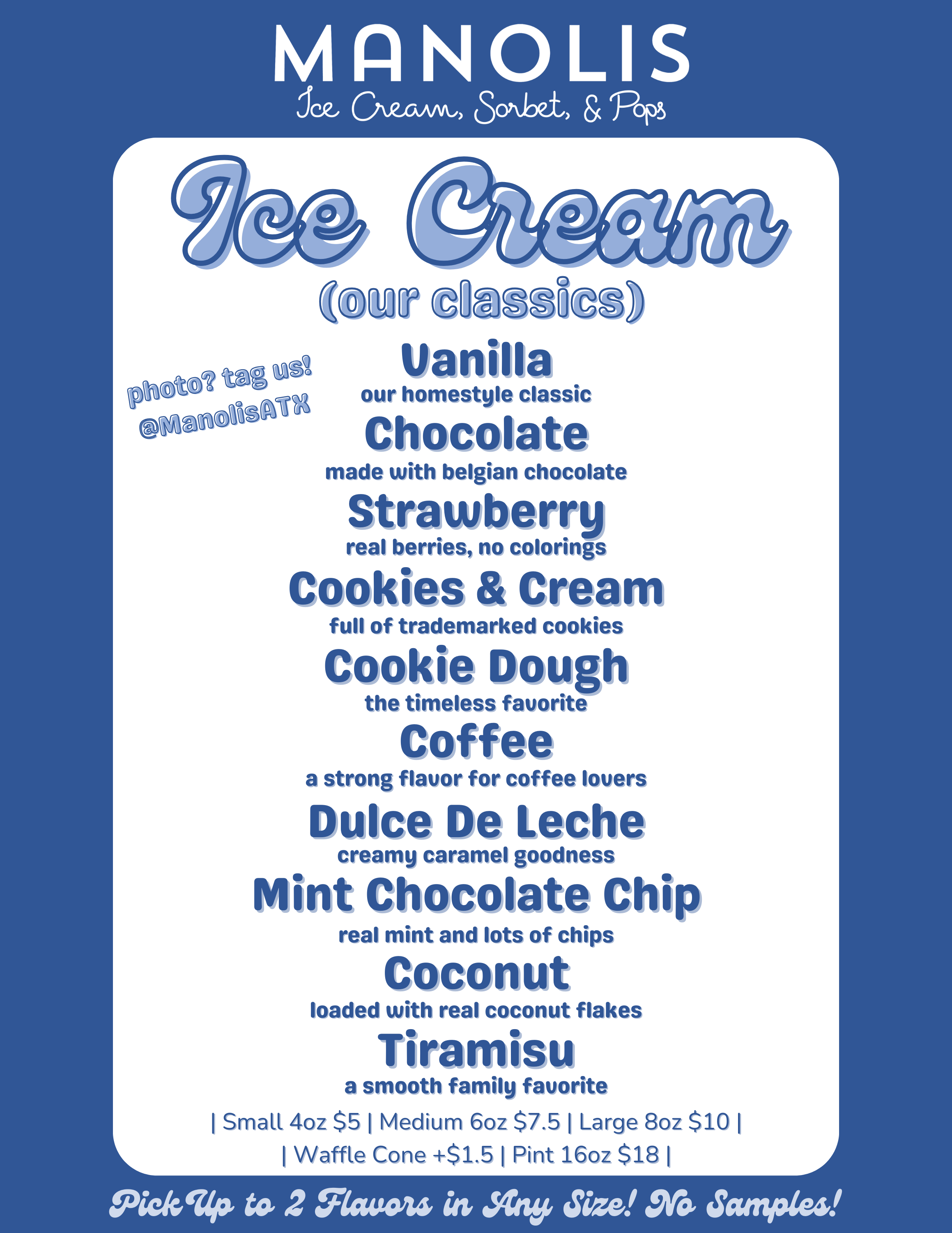
Ice cream classics
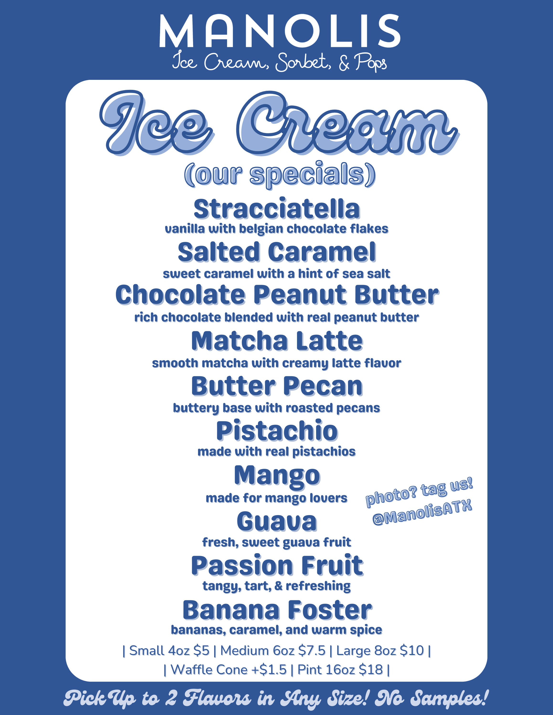
Ice cream specials
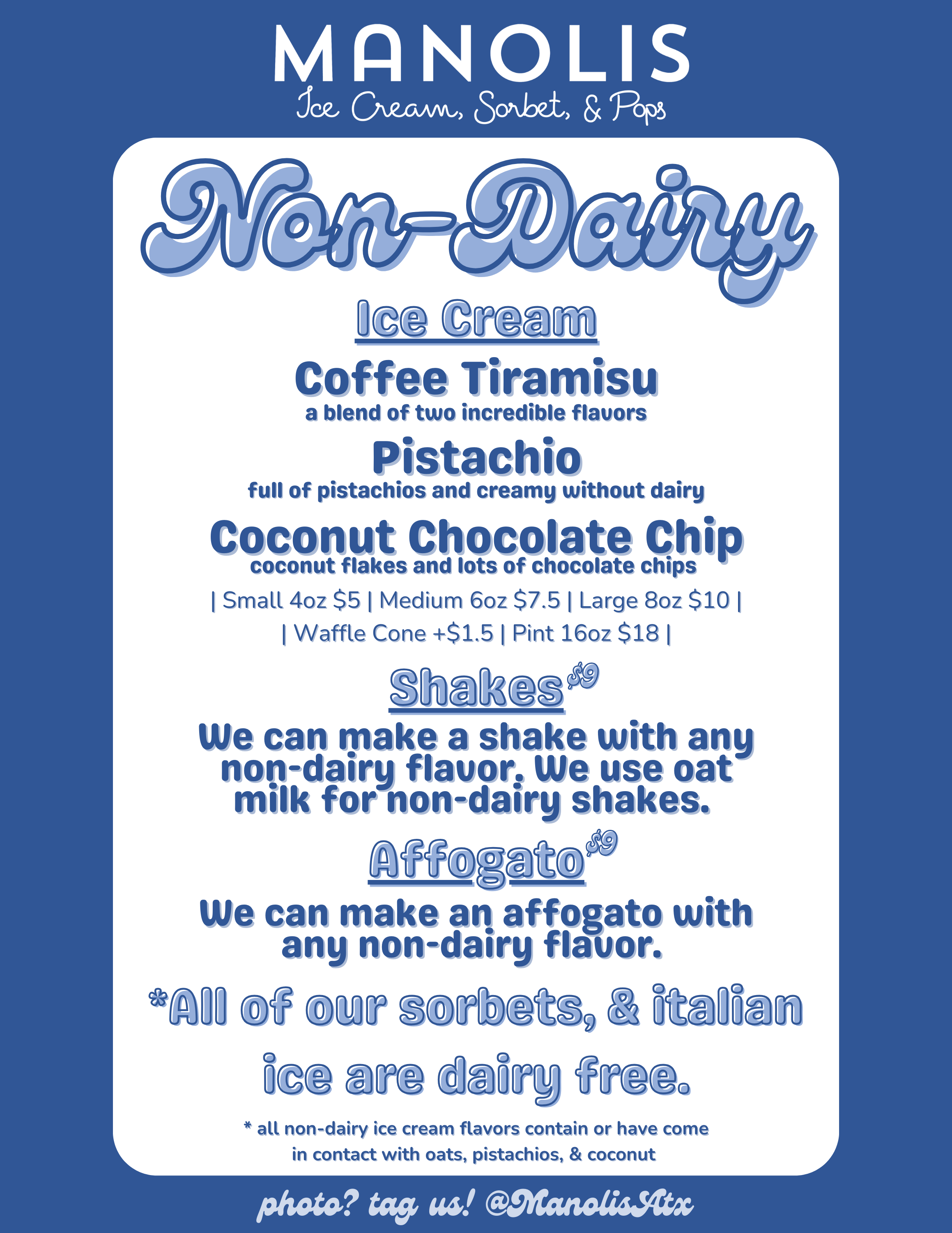
Non-dairy
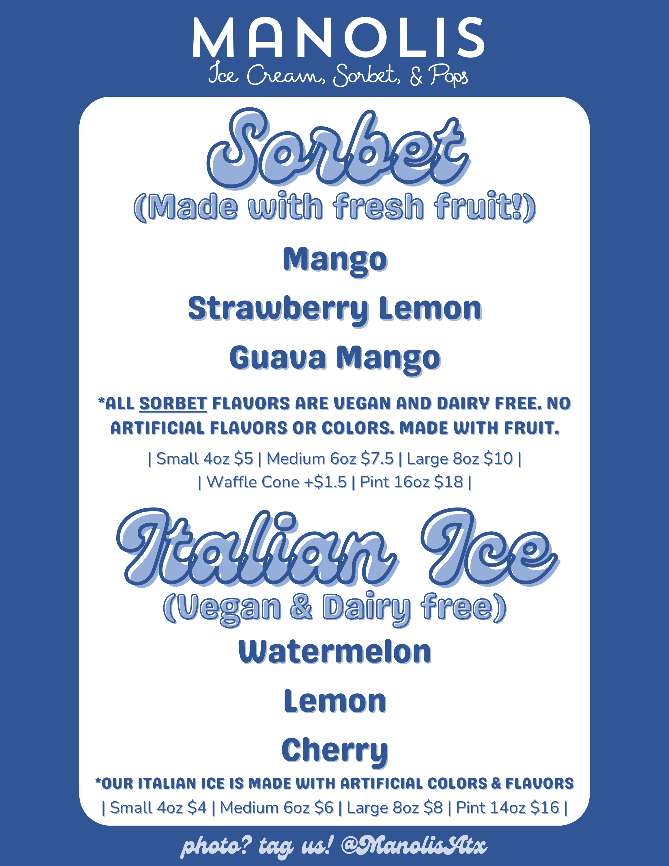
Sorbet & Italian Ice
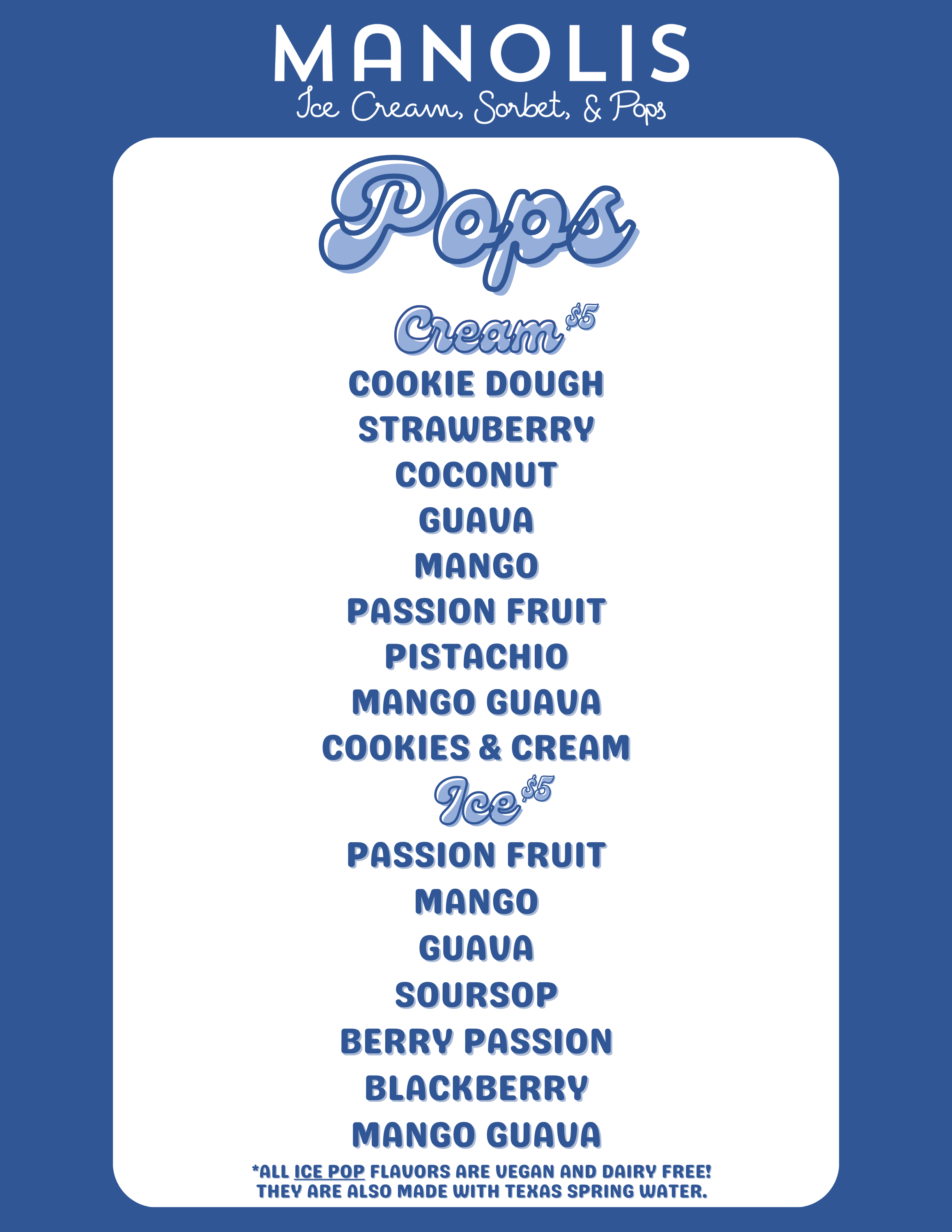
Pops
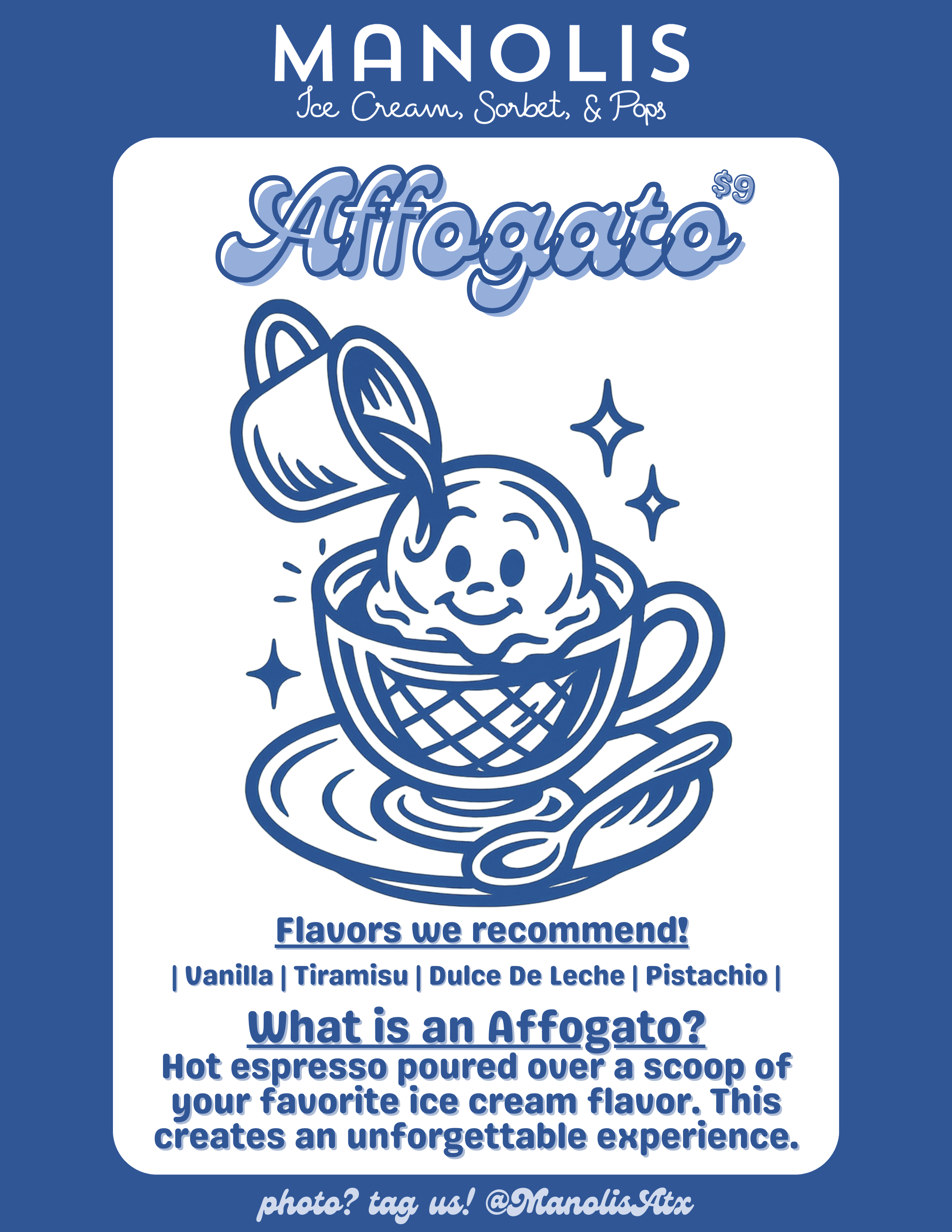
Affogato
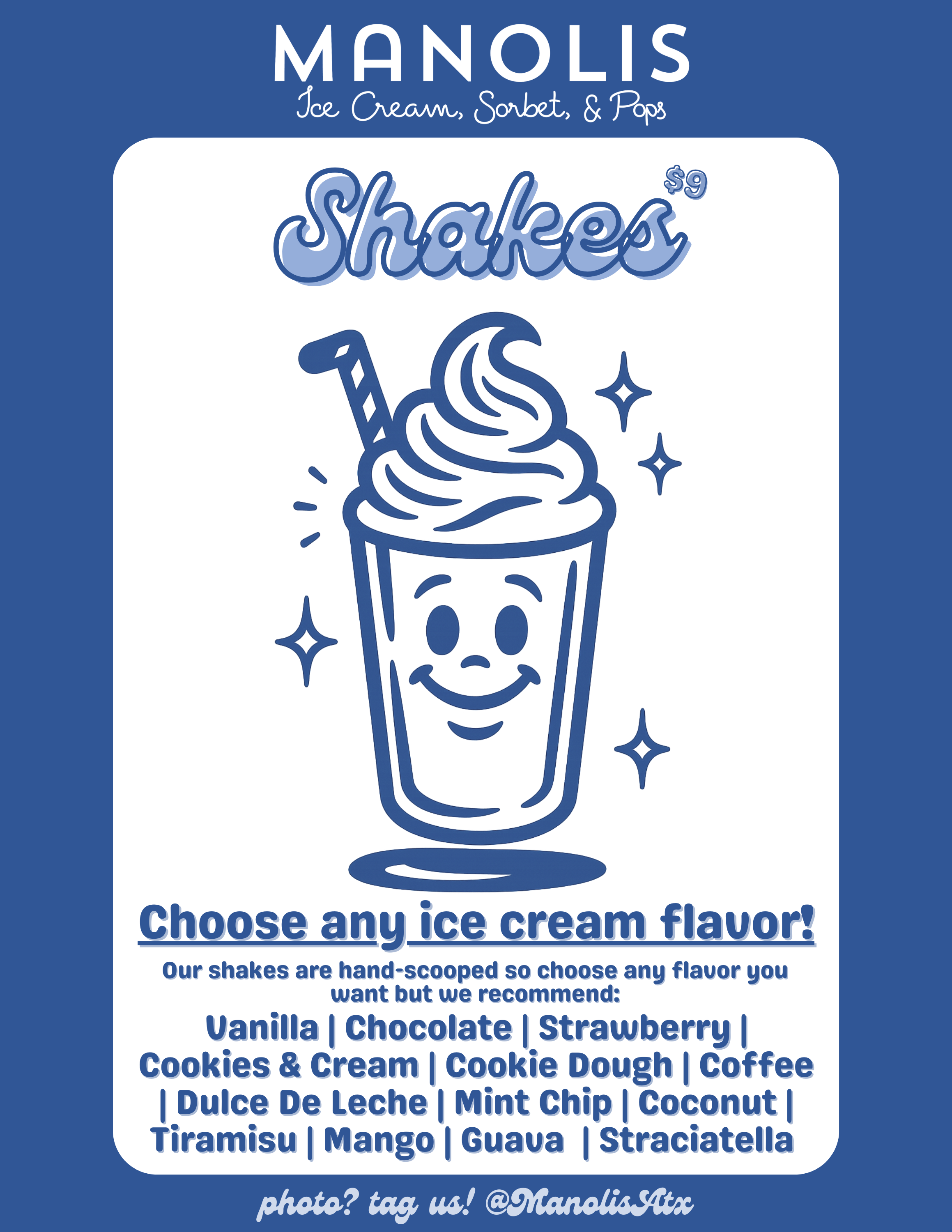
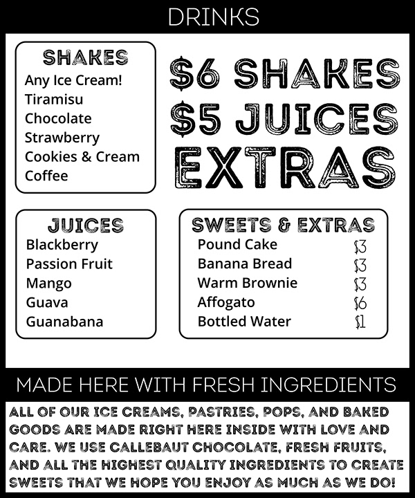
Shakes
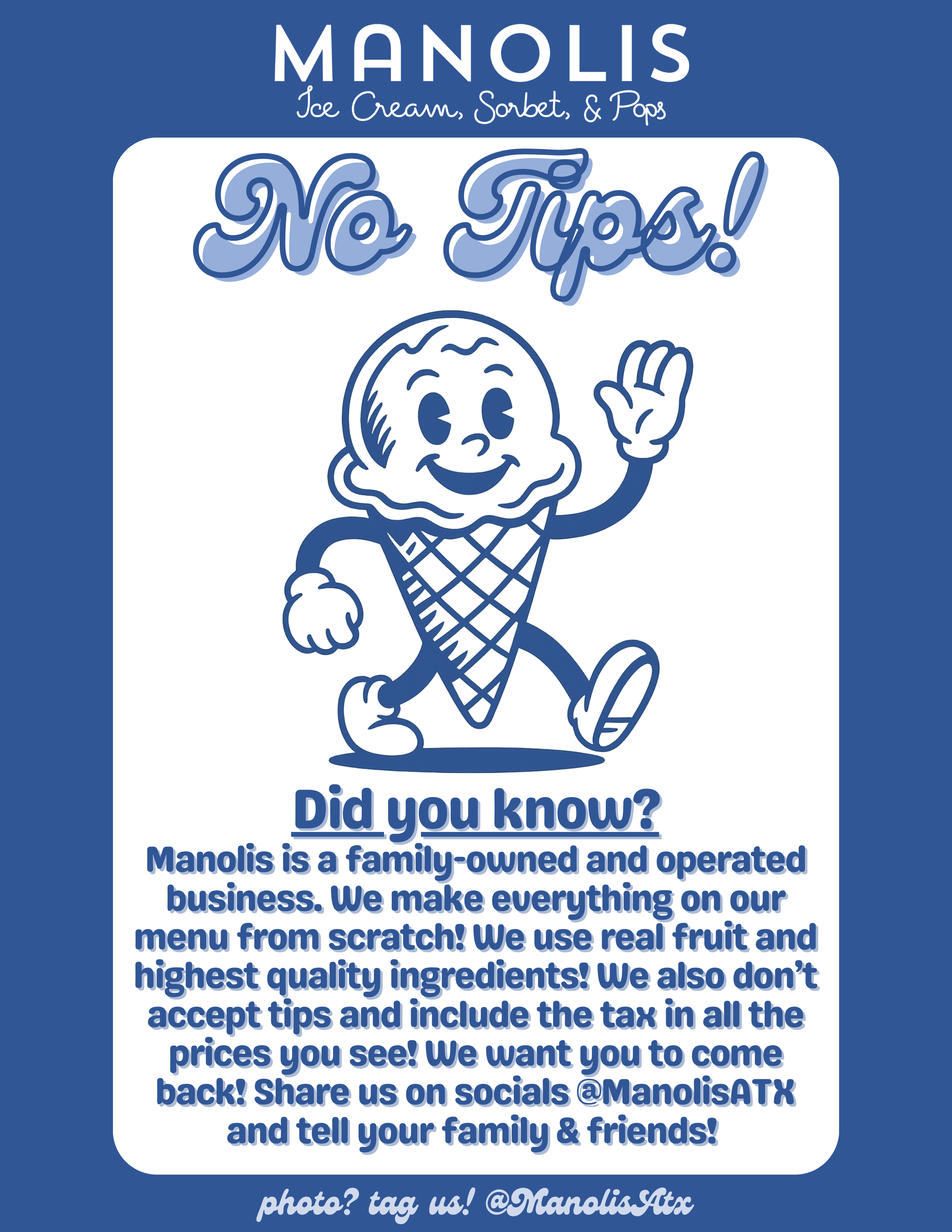
No Tips