Video above goes through all of the UI elements in this concept. Below are more detailed shots.
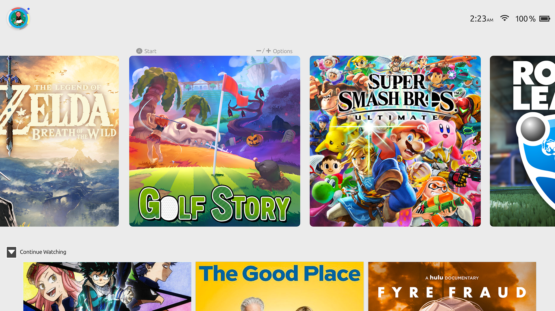
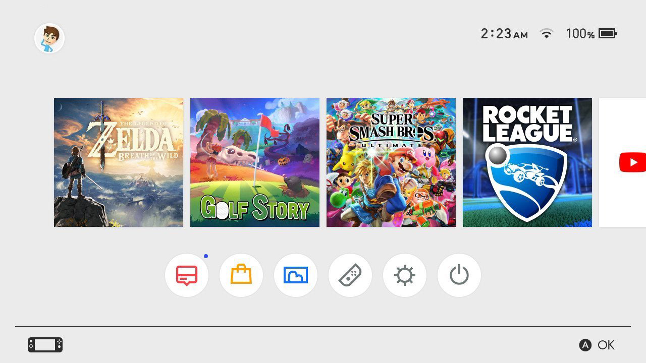
On the left we have my redesign. On the right is the current Nintendo Switch UI. The current UI is very simple and clean but that becomes a problem for users that use the machine often and have lots of games/apps. The mockup I created is based around being able to use the switch as a media consumption device more easily.

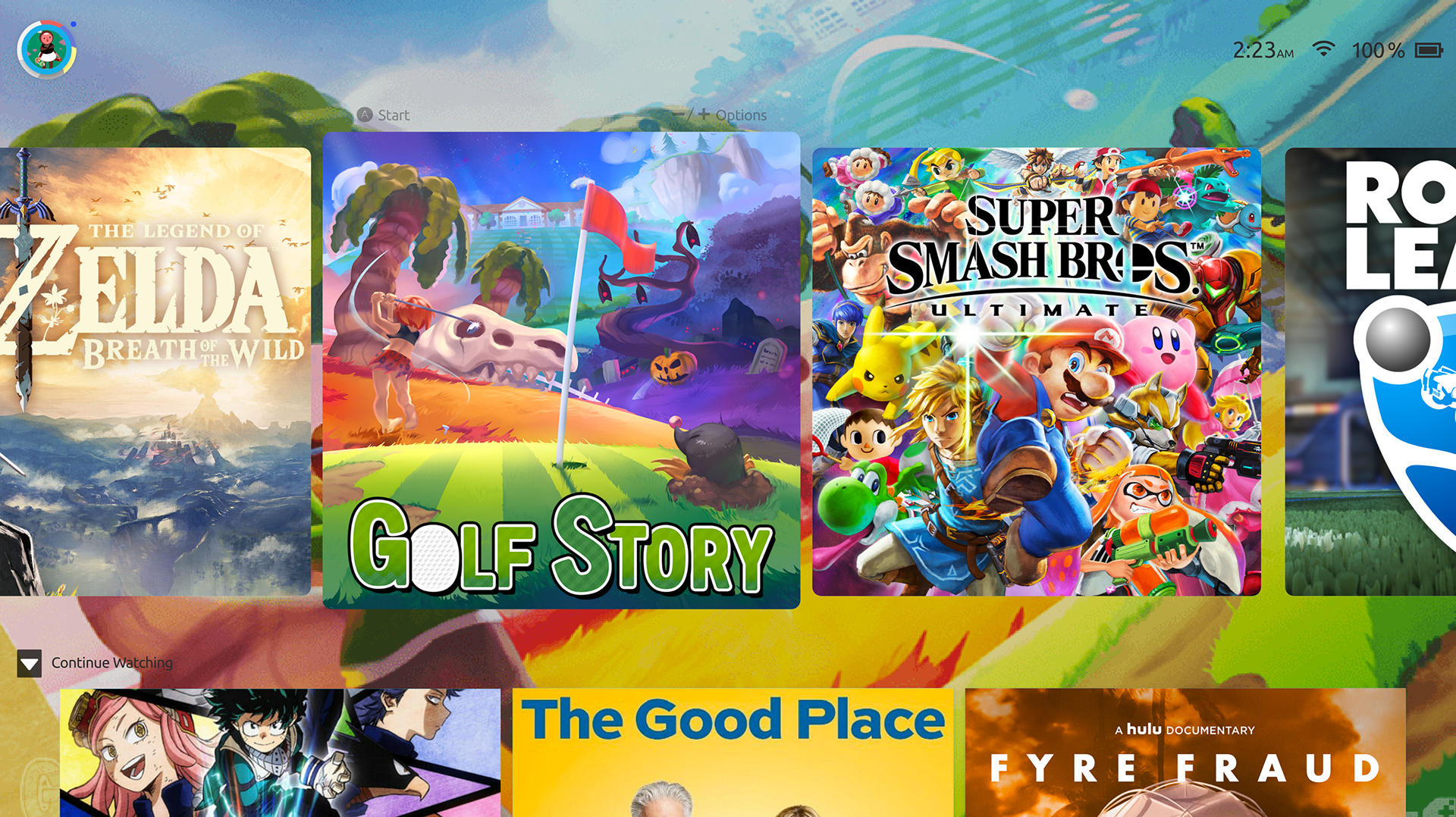
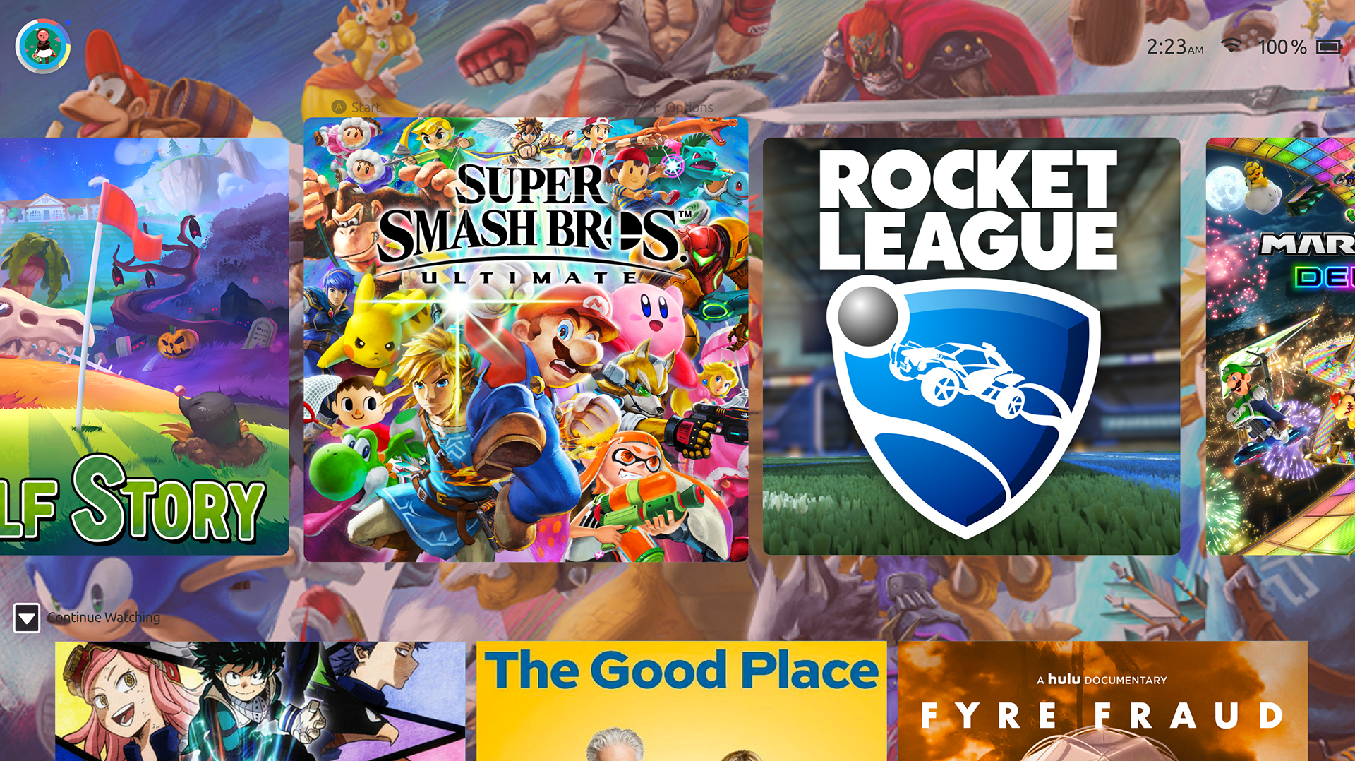
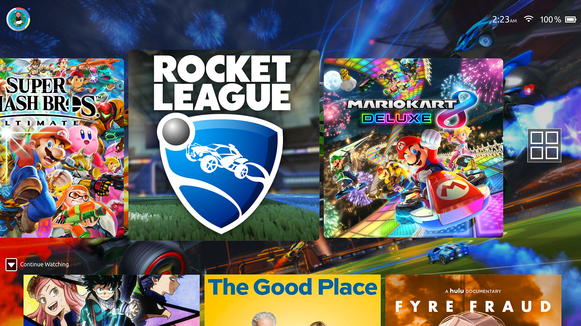
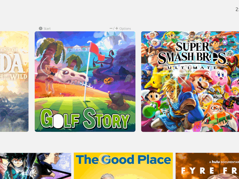
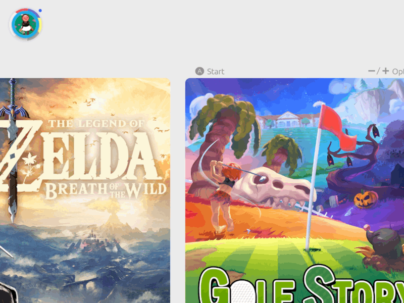
The Nintendo Switch UI currently lacks the ability to change the background. While adding your own background from ones favorite game is awesome, I thought doing a dynamic wallpaper that changes based on what is being viewed would be pretty neat!
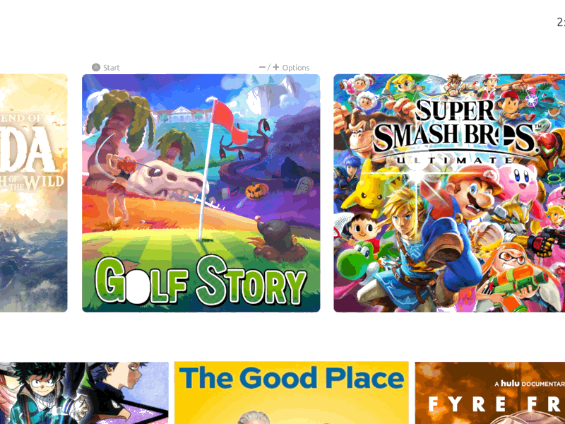
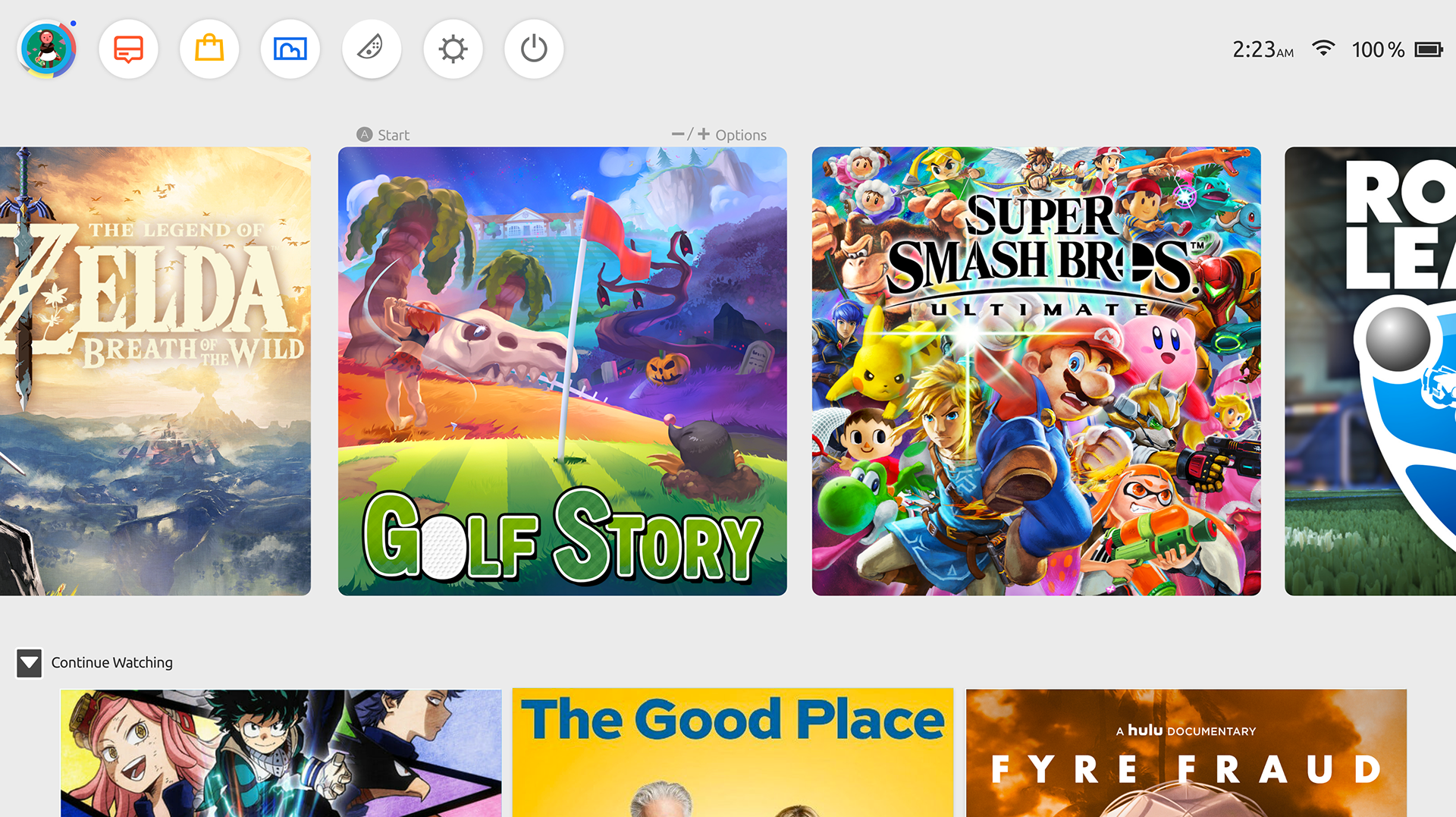
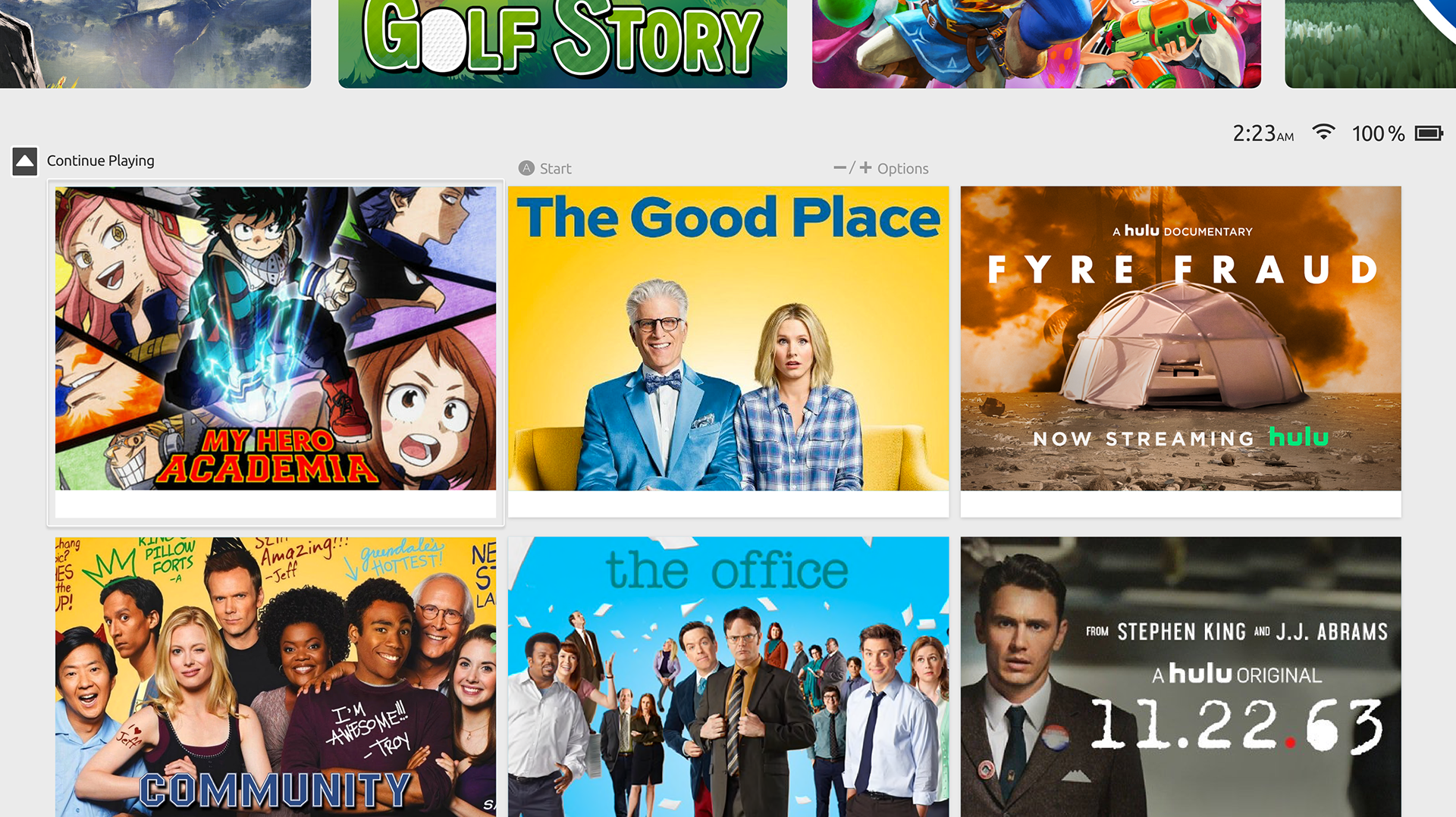
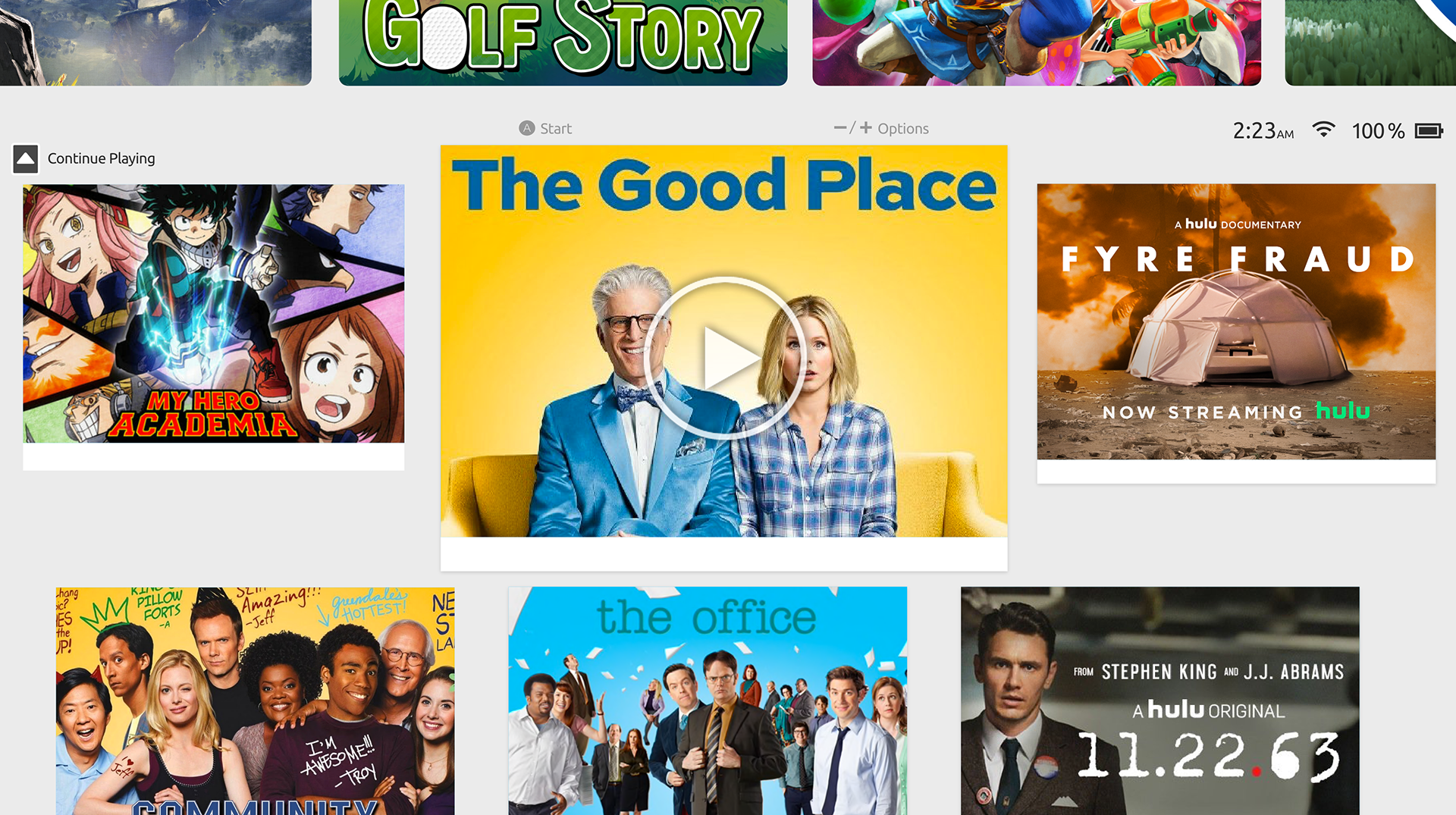

Many people use their Switch for watching videos but the Switch lacks integration with media apps. This is indeed a gaming machine but considering its portability and ability to hook up to numerous TV's around the house, some more focus on media consumption would be great for users. I went with a grid design that matches the current aesthetic that Nintendo is going for and kept the animations light since those tend to slow down the interface.
On the left we have the animation for the dynamic wallpapers and media selection. On the right we have the animation for the menu bar which is hidden until needed since those options aren't accessed on a daily basis.
UI Featured in Olivier Raymond's Nintendo Switch UP Concept Here.