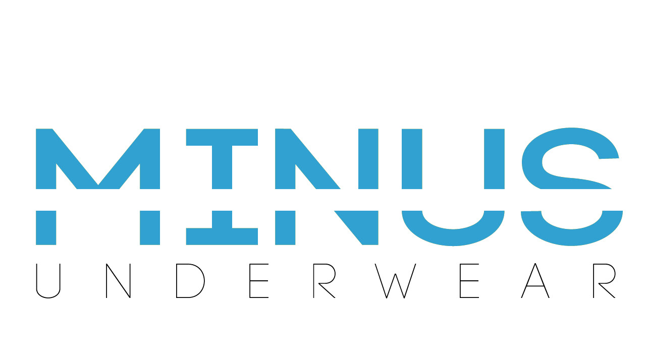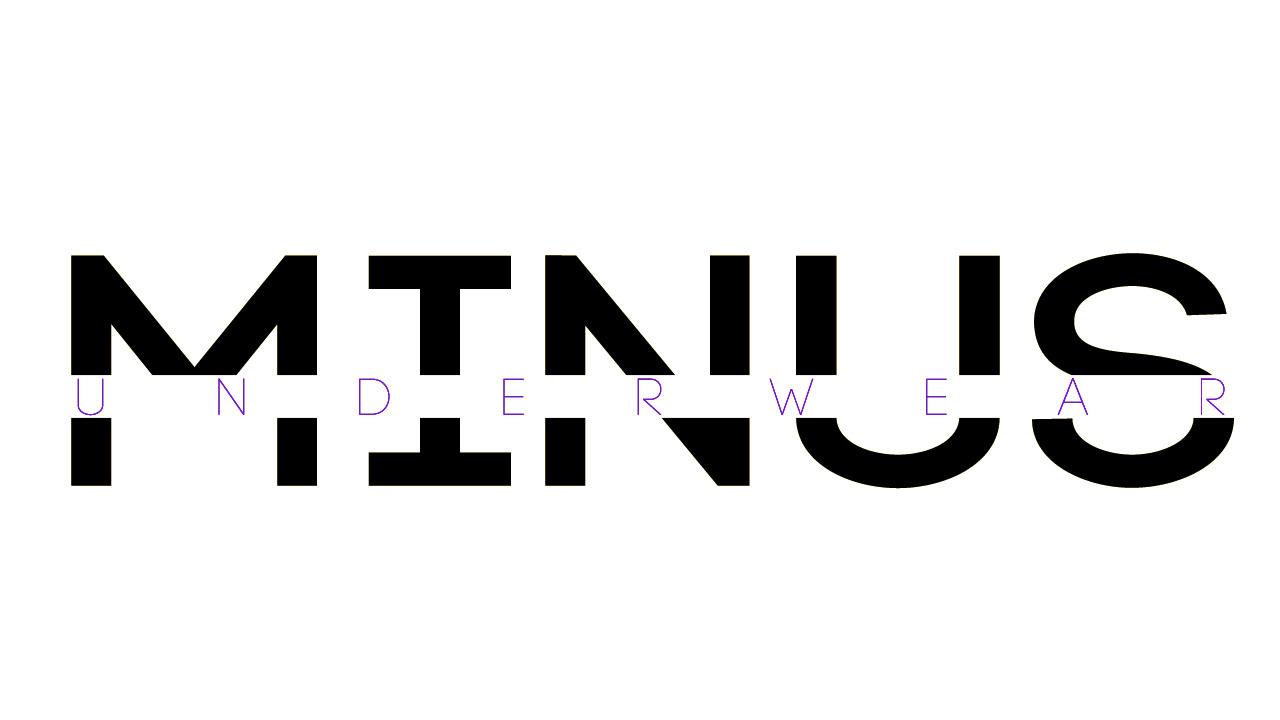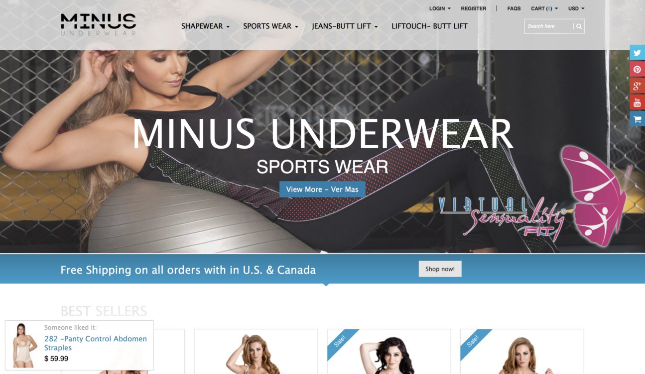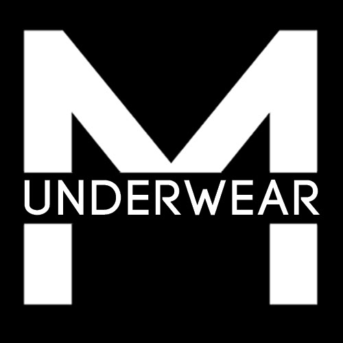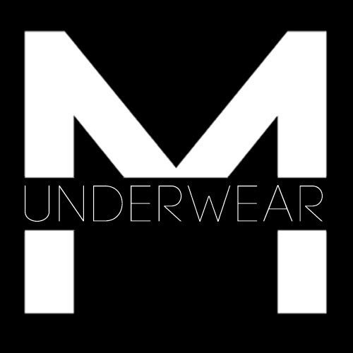

I was approached to come up with the name for the website and to design their logo. This is the first major logo that I made which was not for one of my personal online projects. I went through many iterations before ending up on the logo featured above. Below are some of the other variations and size adaptations for social media as well as how it looks on the site that it is was made for. The products sold by Minus Underwear were expensive and so took that into account with a logo that would match the price tag while also giving the consumer confidence when buying on the site. I also made sure the logo could appeal to both women and men as products for both genders are sold on the site. Knowing the site would sell underwear & fitness products, I ended up with the word Minus as it conveys many different things and allows for each costumer to interpret it. The general idea was that Minus Underwear would subliminally convey the ideals of ‘wearing less’, ‘being fit’, ‘owning one good item instead of many bad ones’, & ‘feeling healthy’.