I recently took some time to re-design a website that I made back in 2016. The original version of the site was busier and the logo was a bit too plain looking.
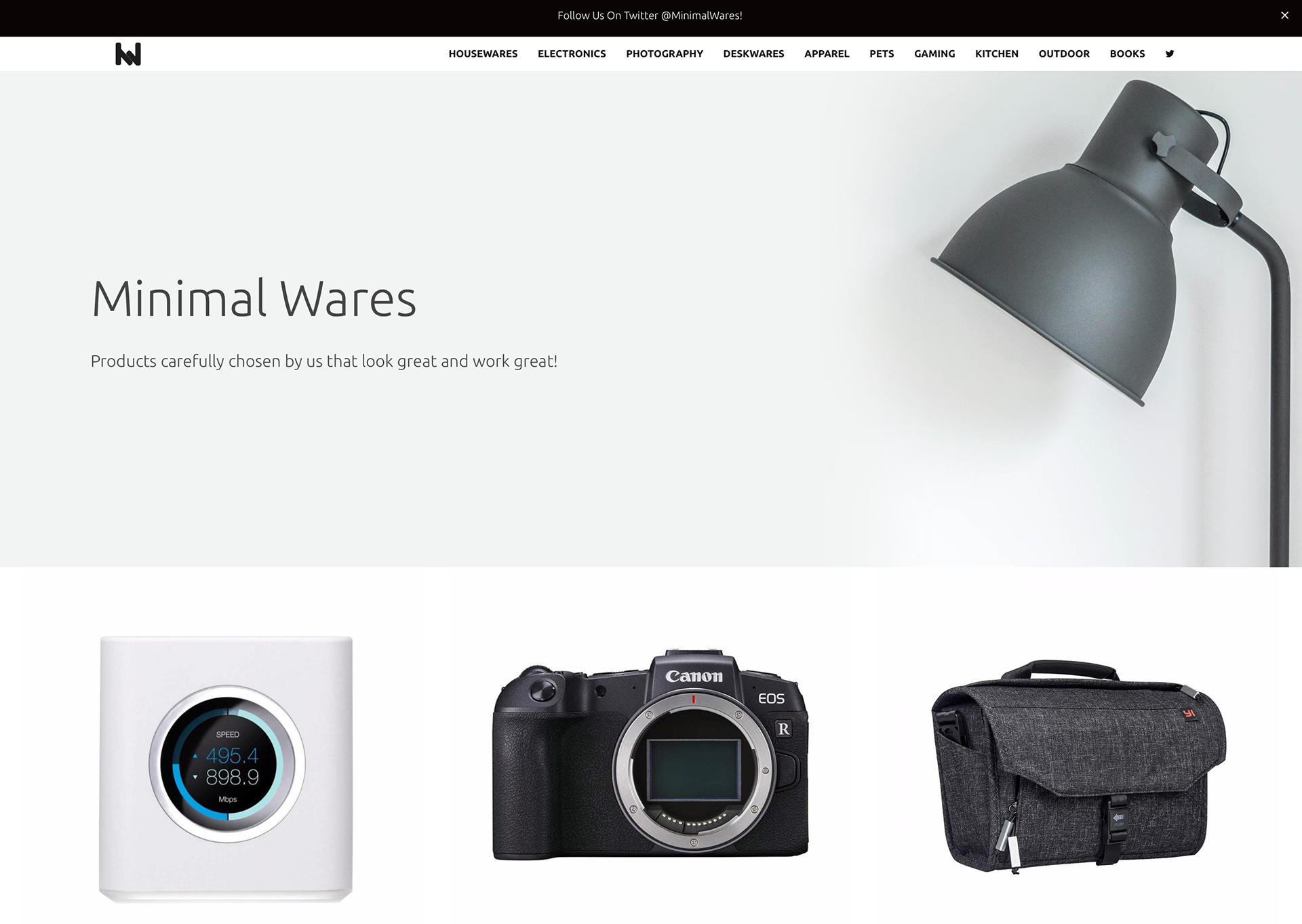
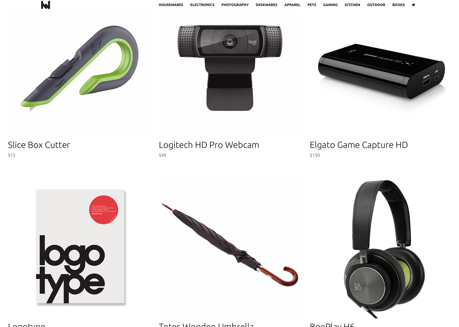
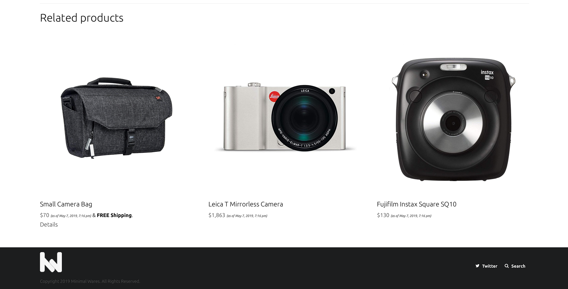
The menu/header is thin and small in order to emphasize the products on the website. The products shown on the site have only one picture along with the name and price. The main pages have no descriptions or information regarding the items in order to keep things clean and continue the emphasis on the products themselves.
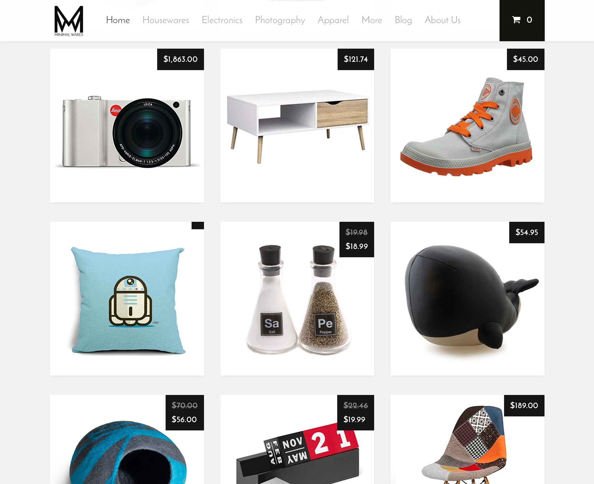
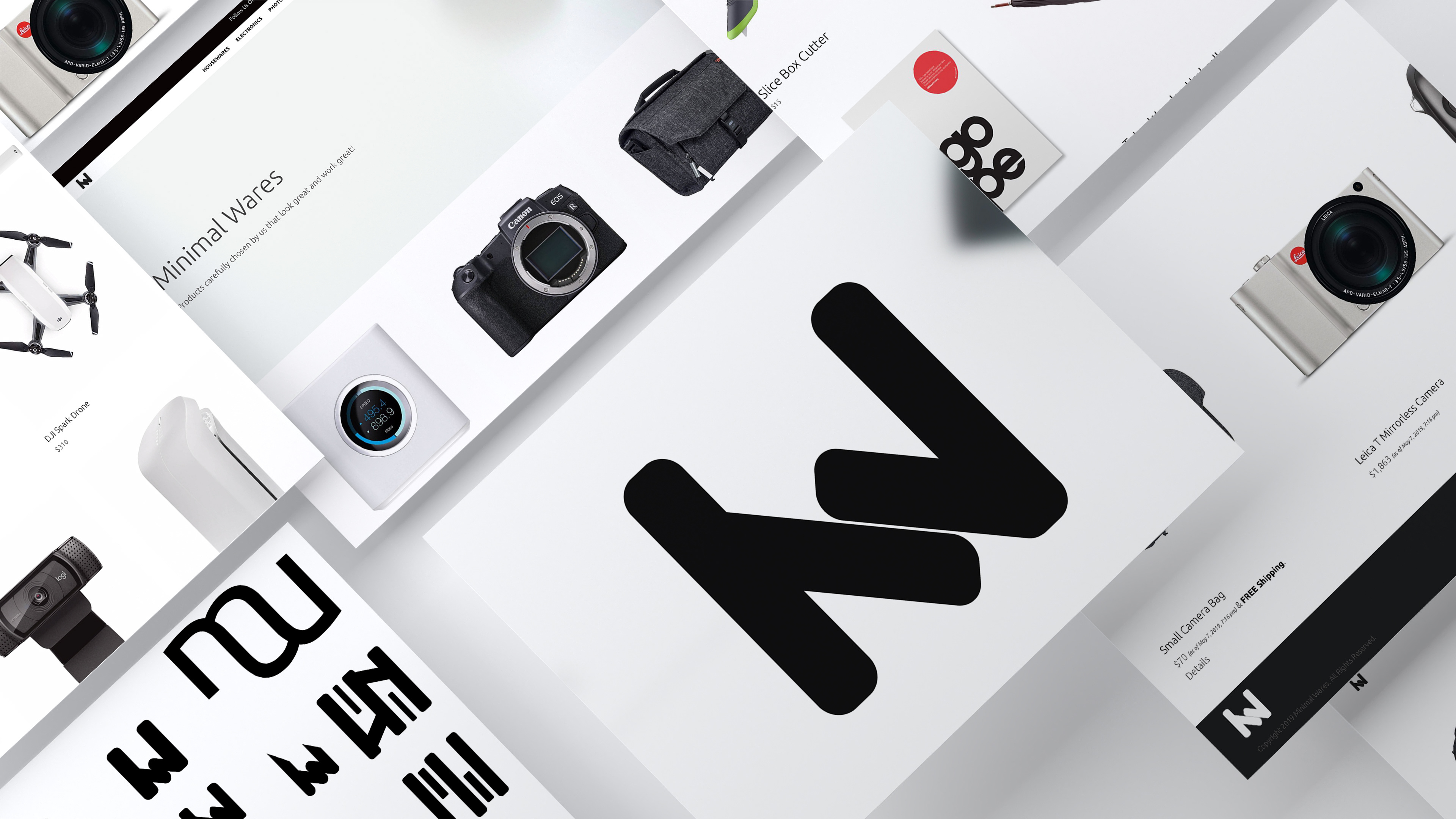
Above is a comparison between v1(left) and v2(right) of the site. I kept the same gray, black, & white theming as it keeps everything looking clean and sharp.
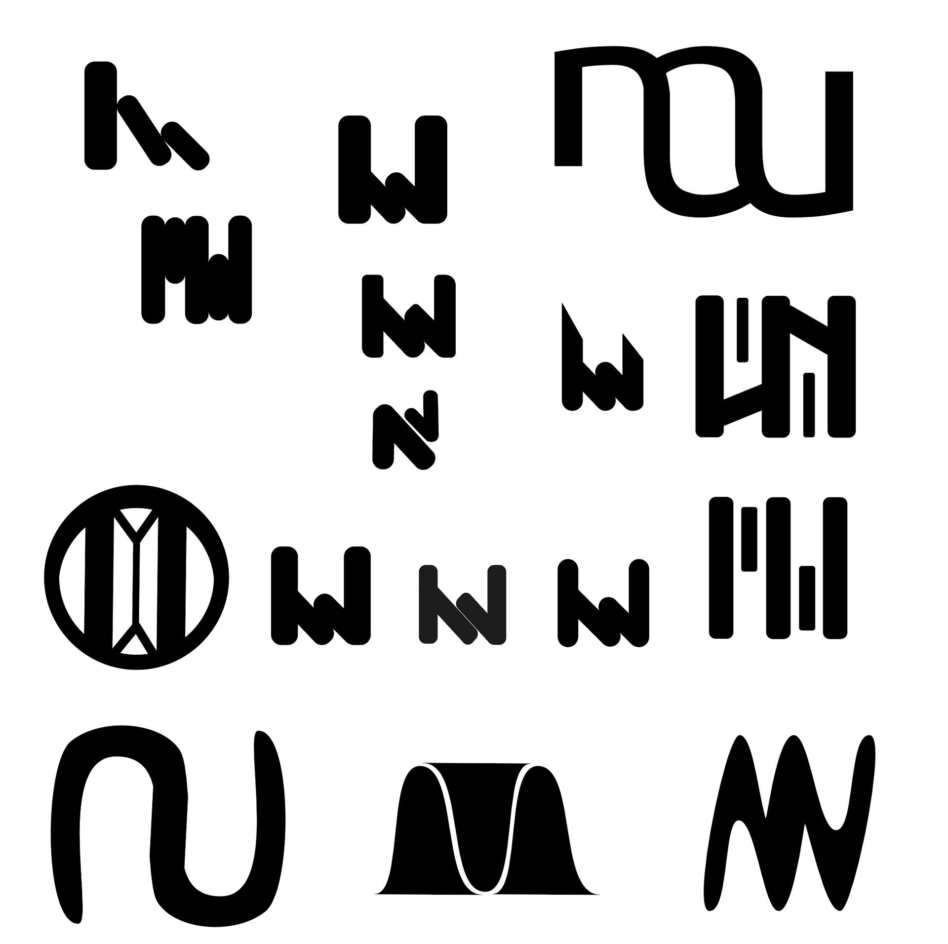
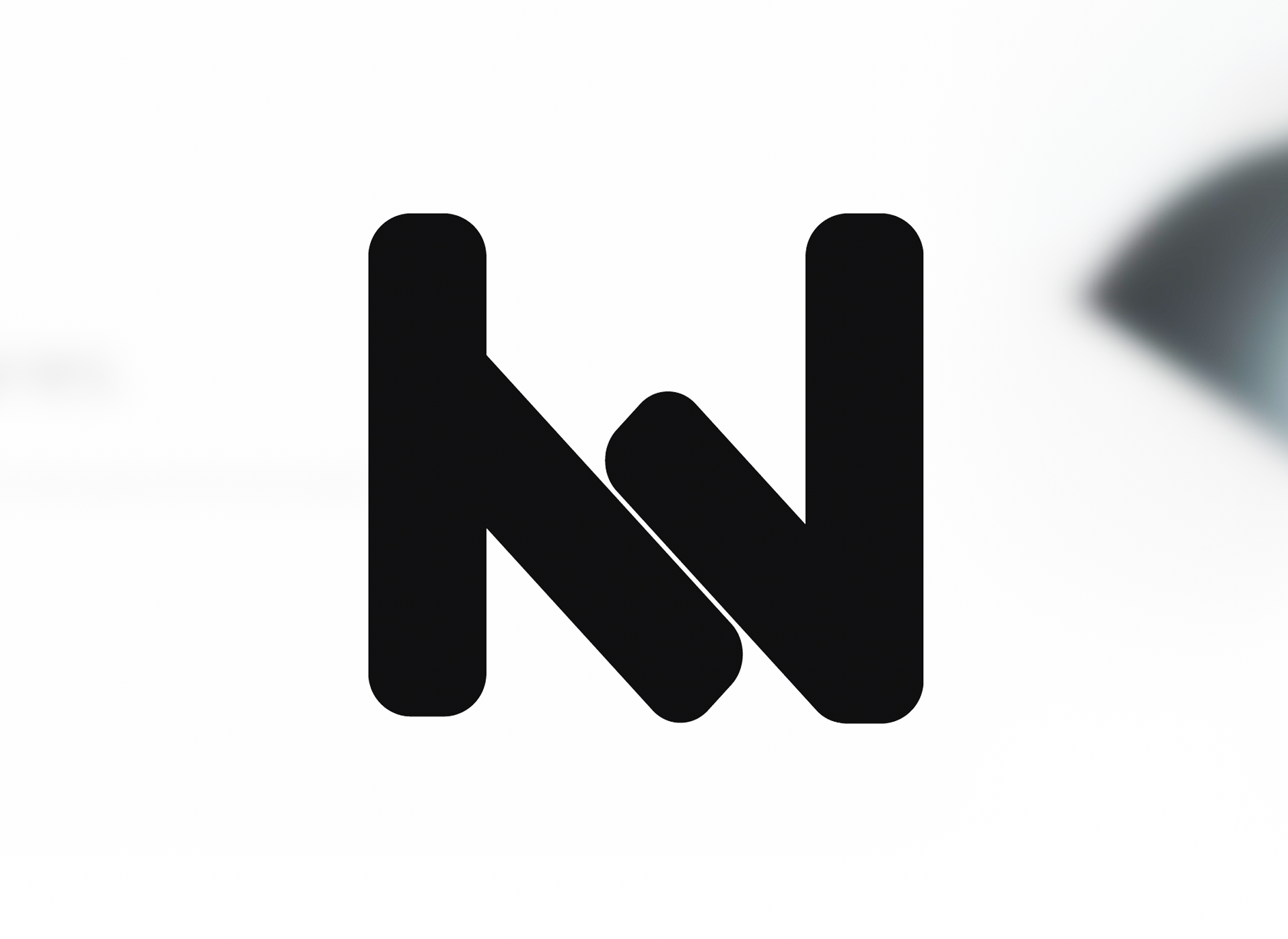
I wanted the logo to be simple yet to somehow incorporate the M from "Minimal" and W from "Wares". I designed over a dozen version and cut those down to what you see below on the left. From that, I took it to numerous people to see what logo idea they preferred and I ended up with the logo shown below to the right. As seen in the previous pictures of the site, the logo looks great in both black & white. The logo is also in a close to perfect square for optimal viewing in social media profile pictures.