For this project I was tasked with designing all of the promotional and branding materials for Manolis Ice Cream, Pastries, & Cakes. No guidelines were given as this was a completely new business in Austin, TX.


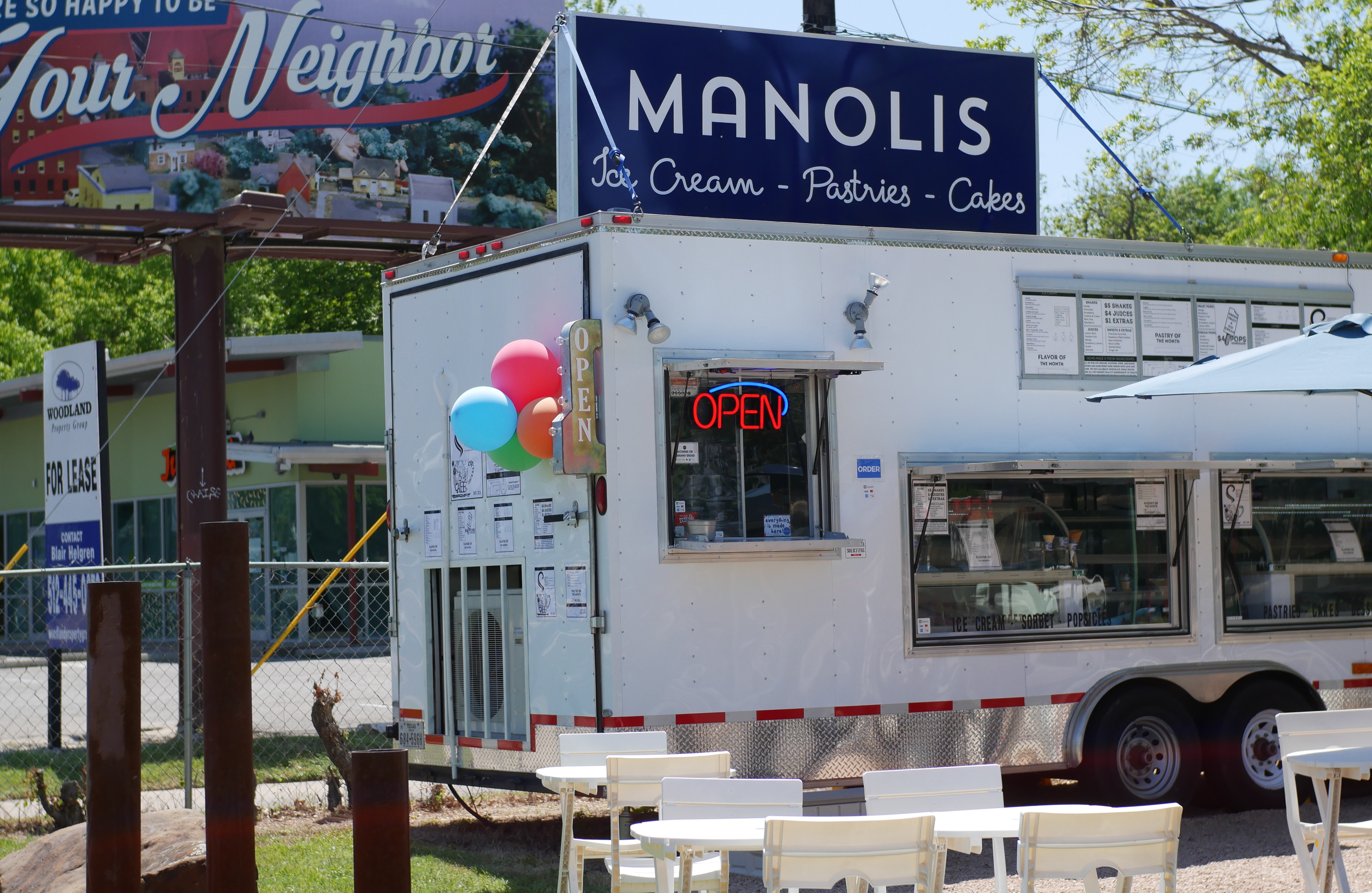
Above are pictures of the main banner that is made to be easily read by cars driving down the street. I kept it clean and simple. I decided to do cursive letters at the bottom to keep it friendly and approachable as it is a business that is there to provide something sweet to improve one's day.
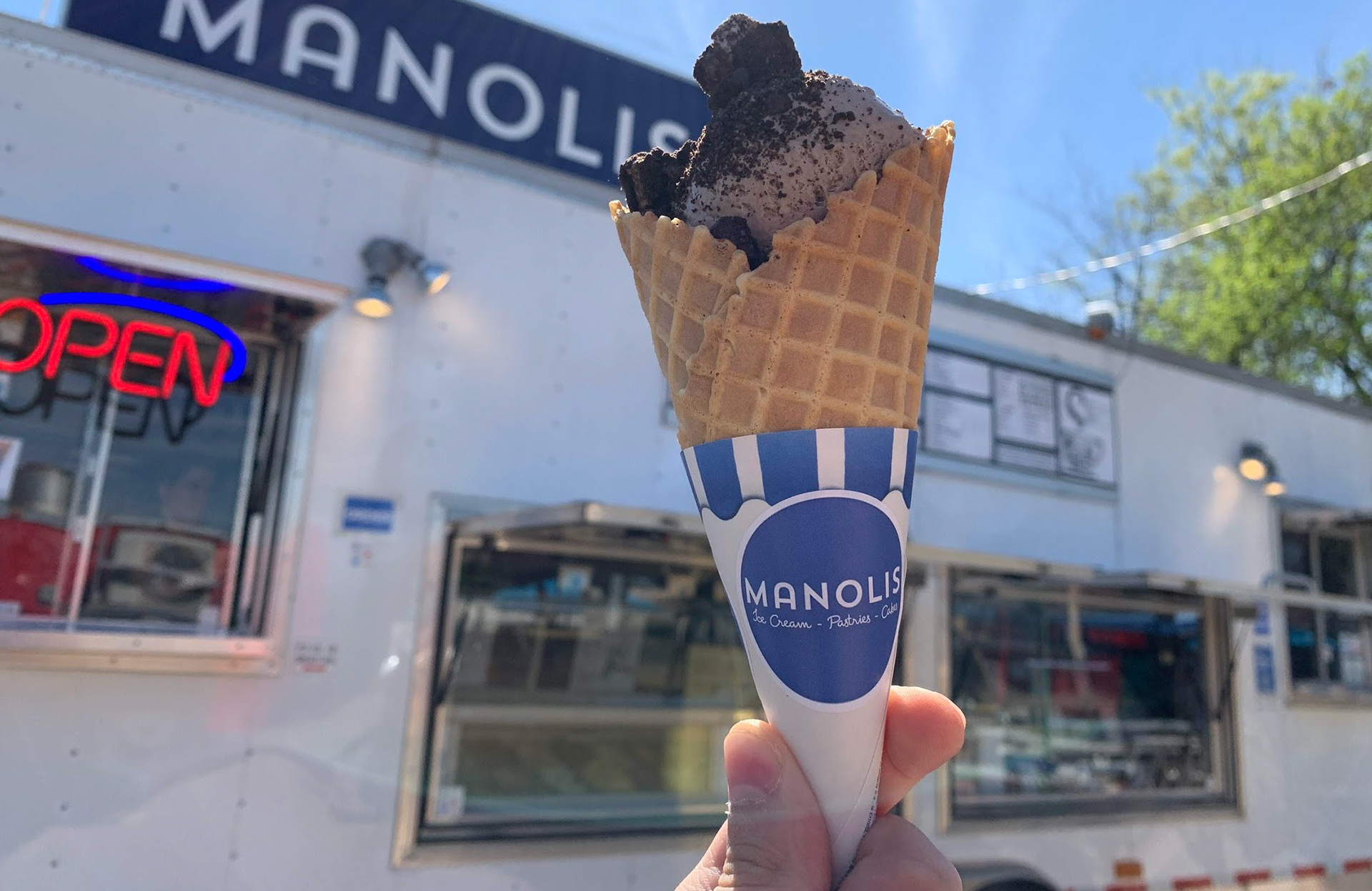
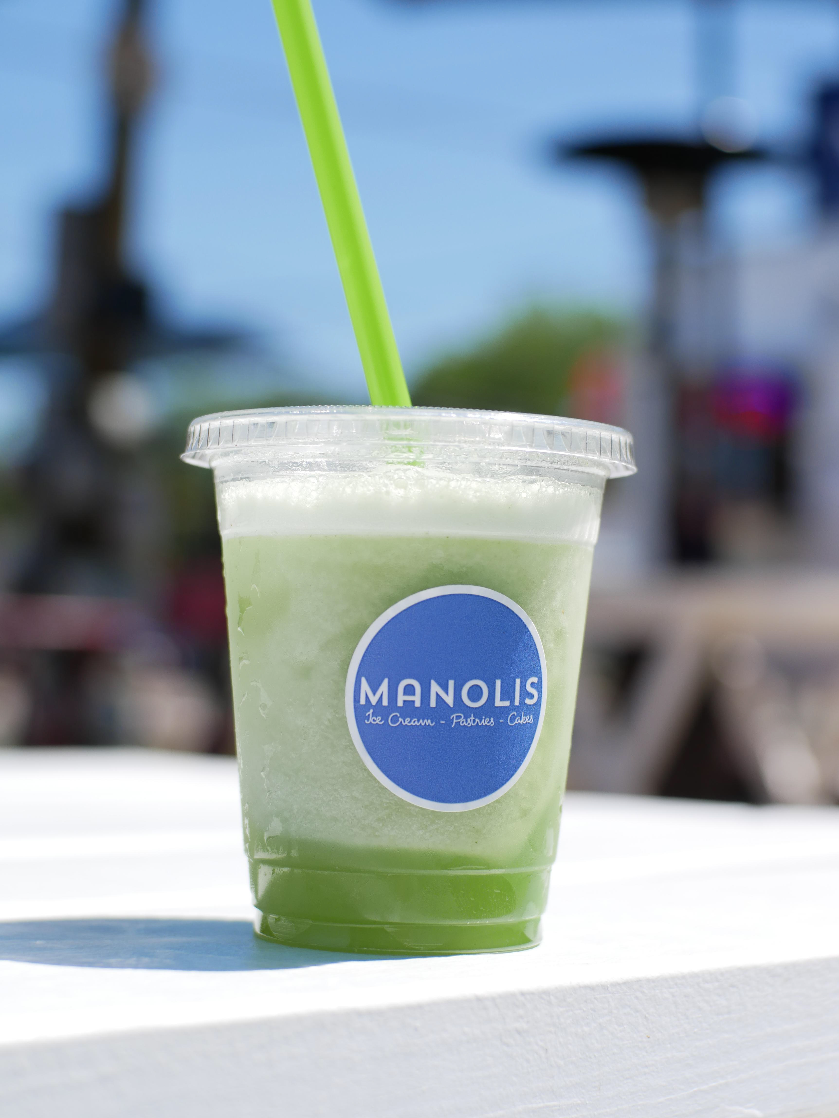
For the main sticker, I went with a round and simple design that kept the main logo and nothing else. The quality of the products is very high and unique so I wanted to keep things as clean and simple as possible to reflect the sweets being sold.
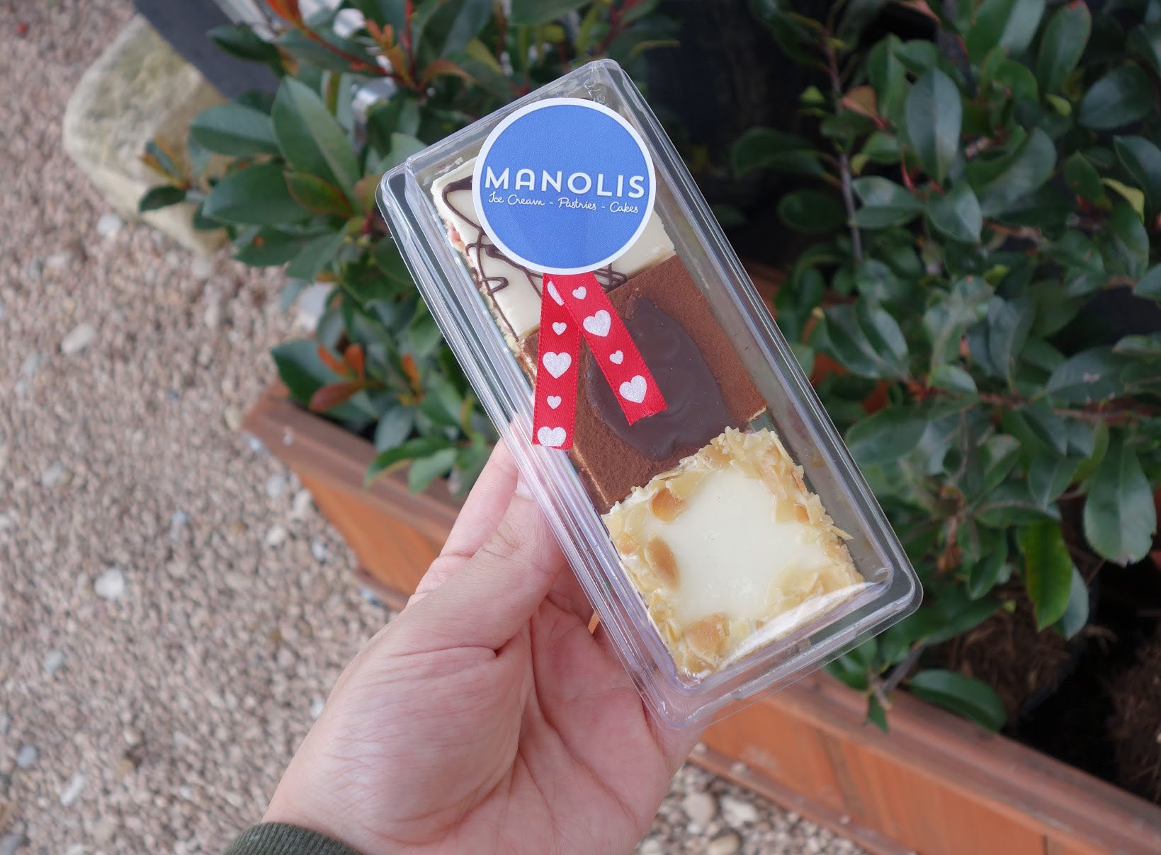
These are two more examples of how the round sticker looks on the items sold at the location.

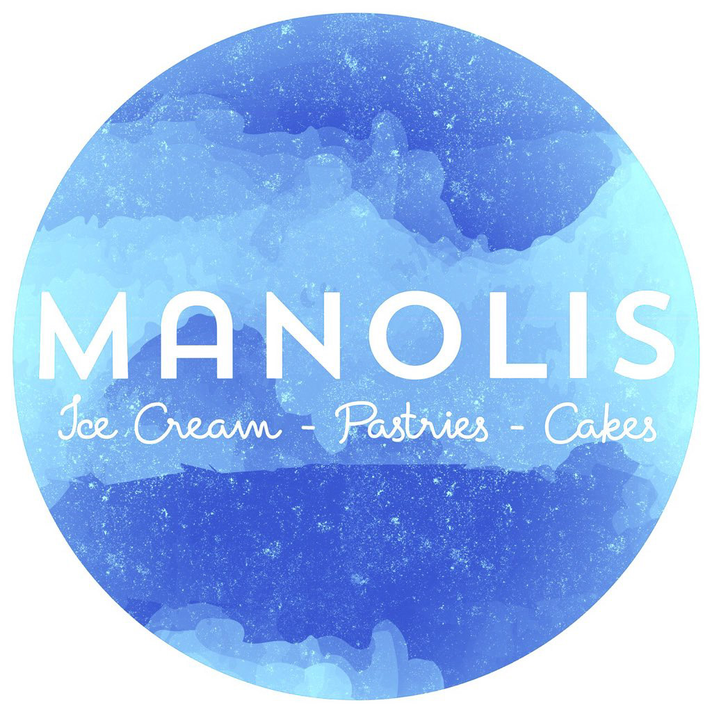
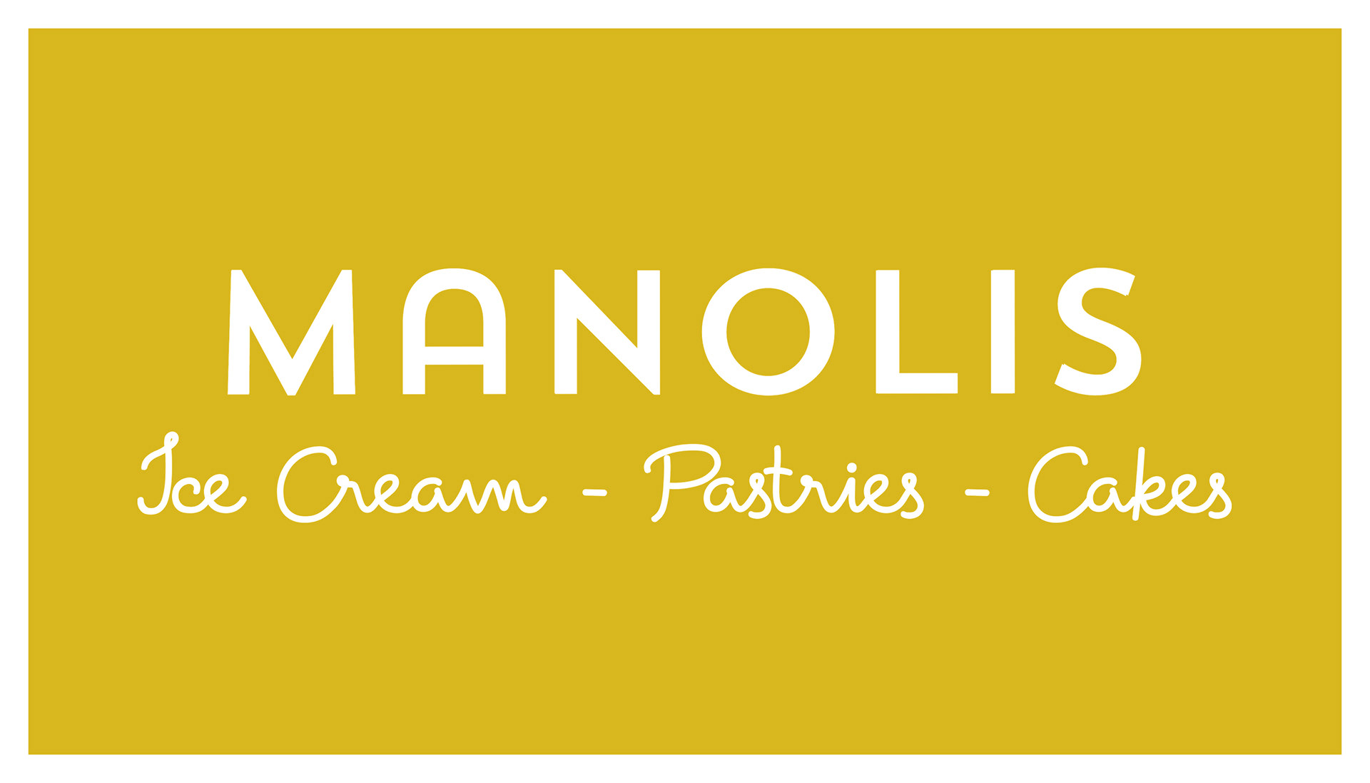
This is the main logo that ended up being everyone's favorite. This then inspired the direction of all the other branding/promo materials.
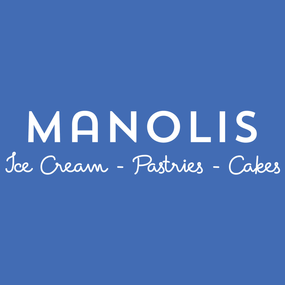
Above are the two main logos used for social media. I came up with the one on the left to match the sticker used on products. I love this one because it gives off an artisanal feel that matches perfect with the Manolis mission of making everything right inside their store.
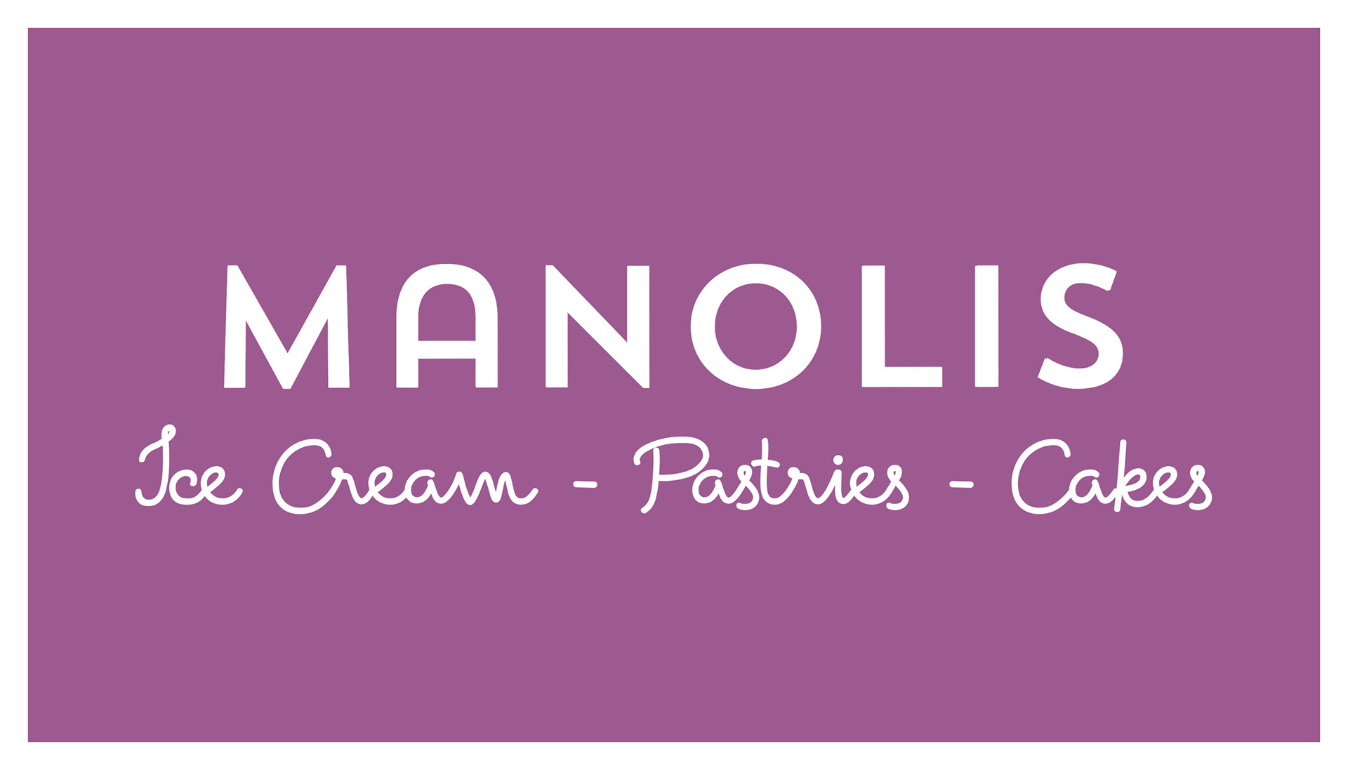
These were some explorations into other color palettes for the business and different sticker designs. Ultimately, none of these ended up being used. I particularly like the middle one which was almost the front of the business card but we ended up going with something more simple for that.
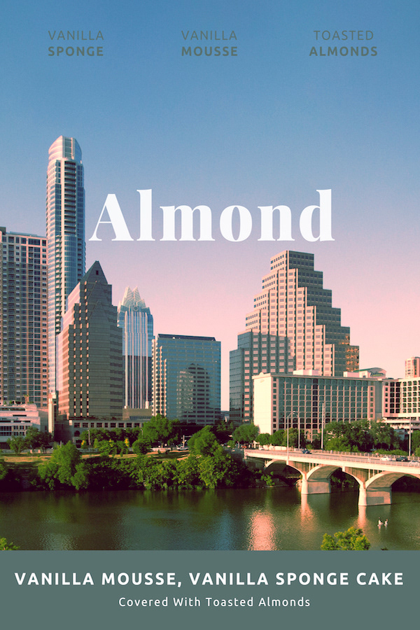


In the pastry display cases there are signs for each pastry. These were the first designs that ended up being used for a short time when Manolis first opened.
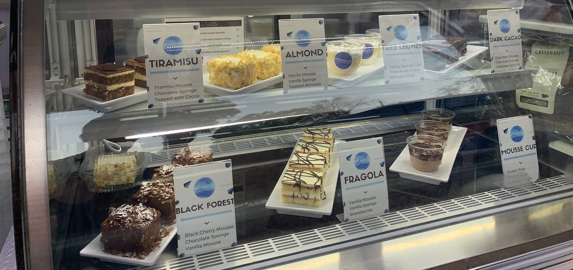
These are the final designs for the pastry display names. I used the familiar logo that I made for the social media accounts.
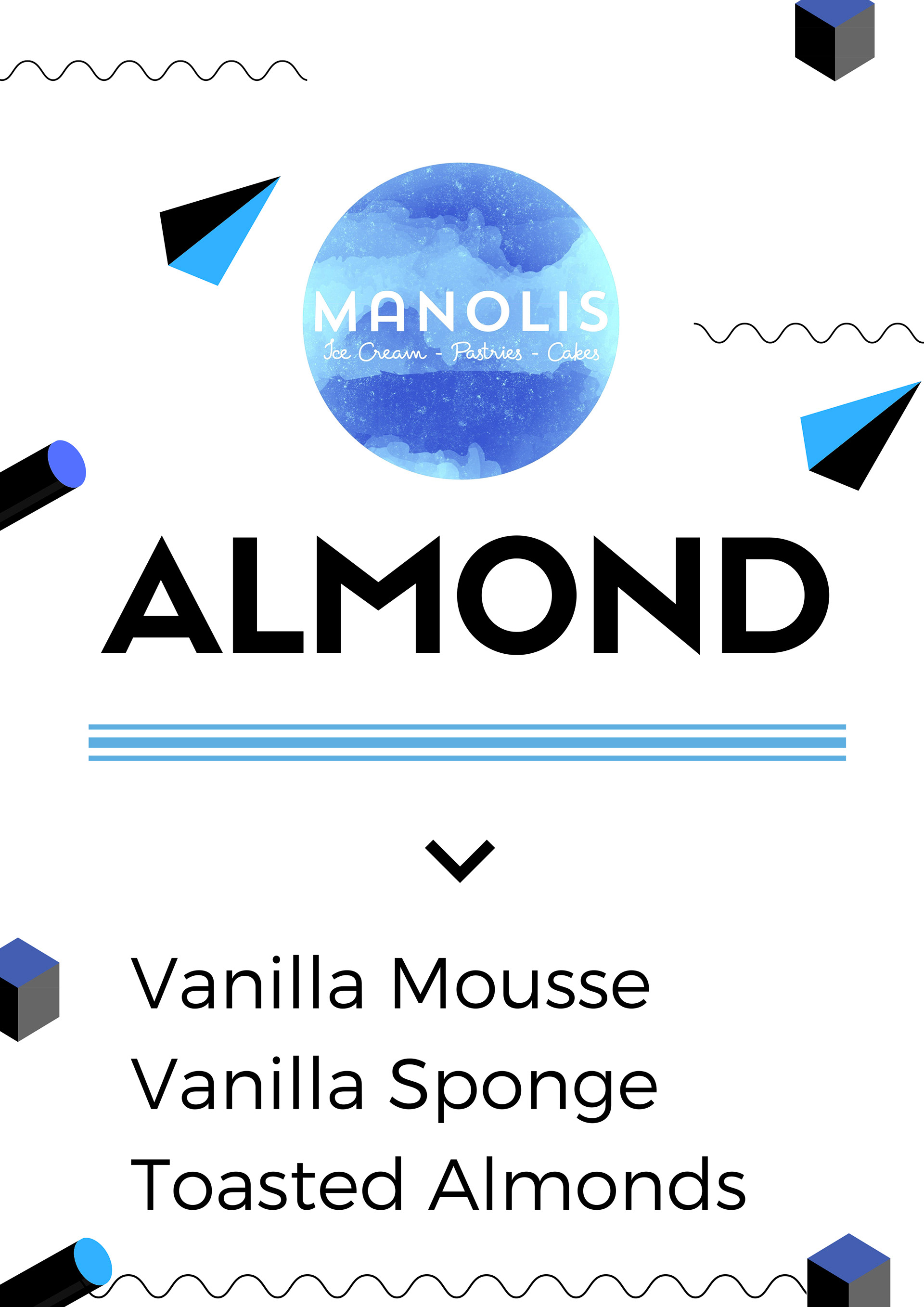


That logo paired with some blue shapes make things look modern, simple, and fun.


On the left we have a sign for placing on a window or display case. In the middle is a small newspaper bulletin ad. On the right is another sign for a window or display case that has completely different colors to the store, I like this because it really stands out which is vital as the message is very important to the core of the business.

This is the simple business card design. Nothing fancy, straight to the point.


Simple design to show the sizes of cakes when customers are placing an order.
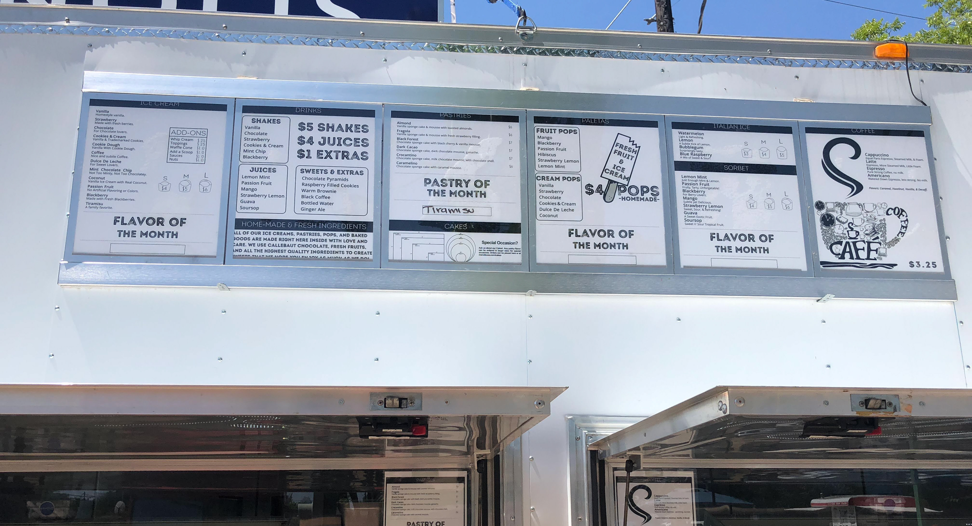
This is the menu. The sign itself lights up so I made it in black and white to make sure things were easily readable, striking, and cheaper to print as these get updated often.
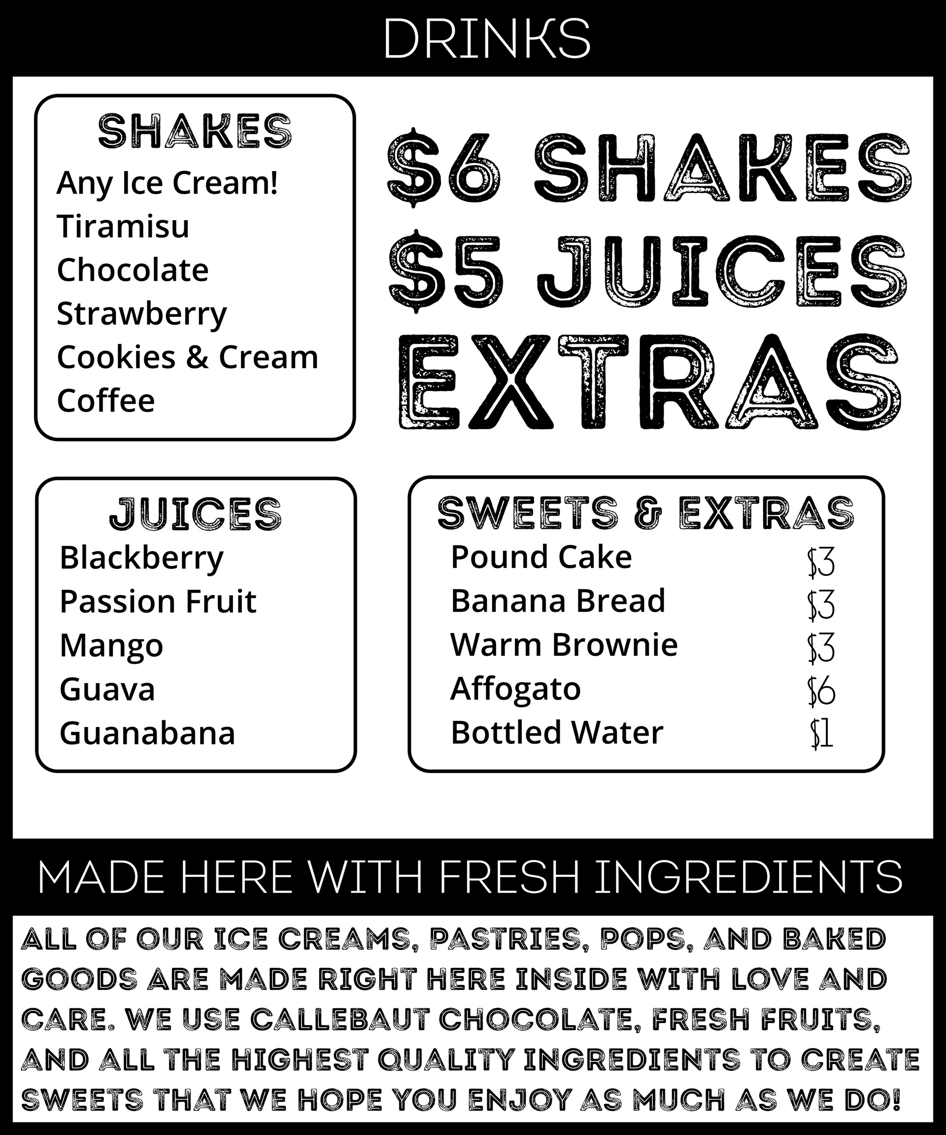
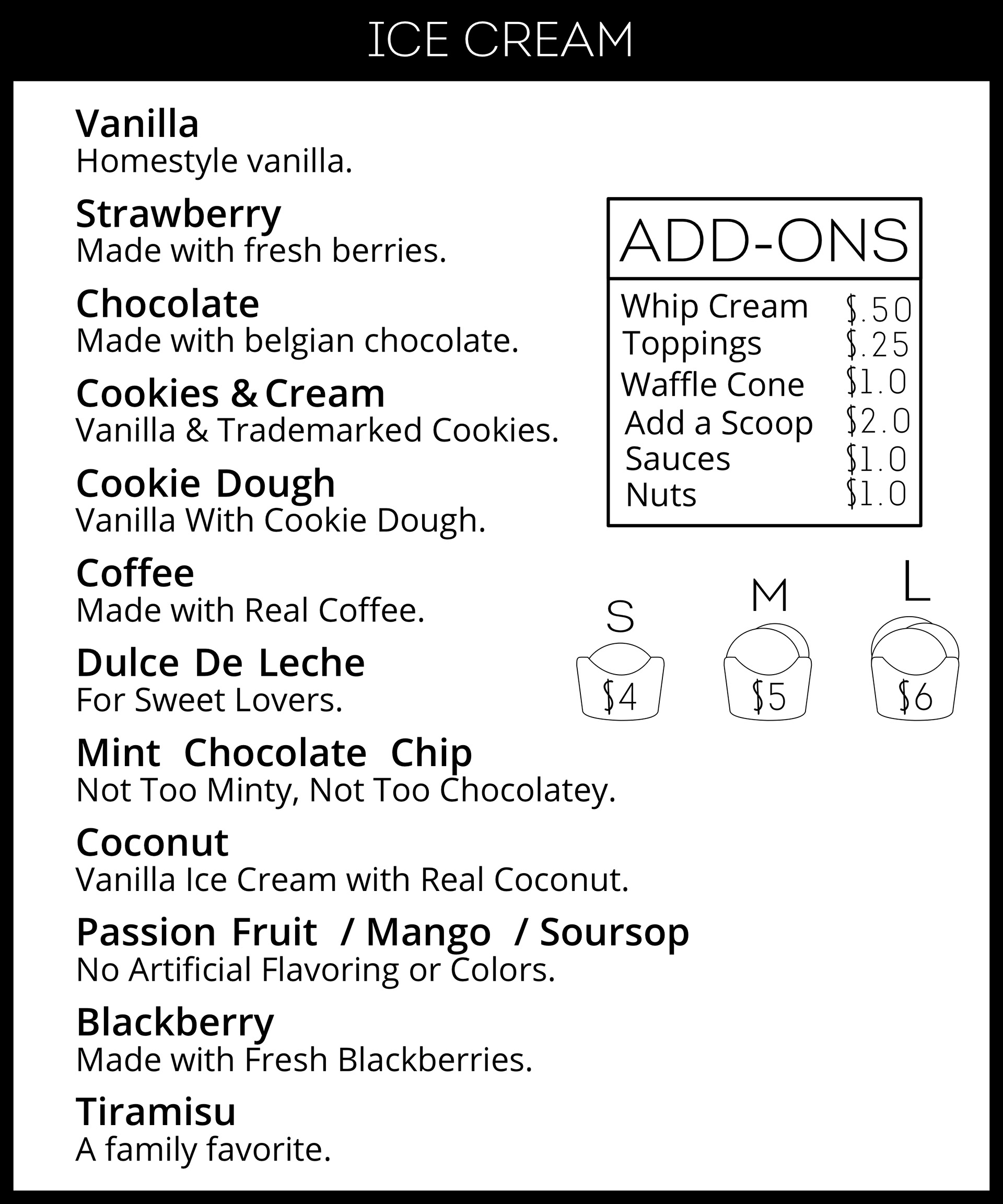

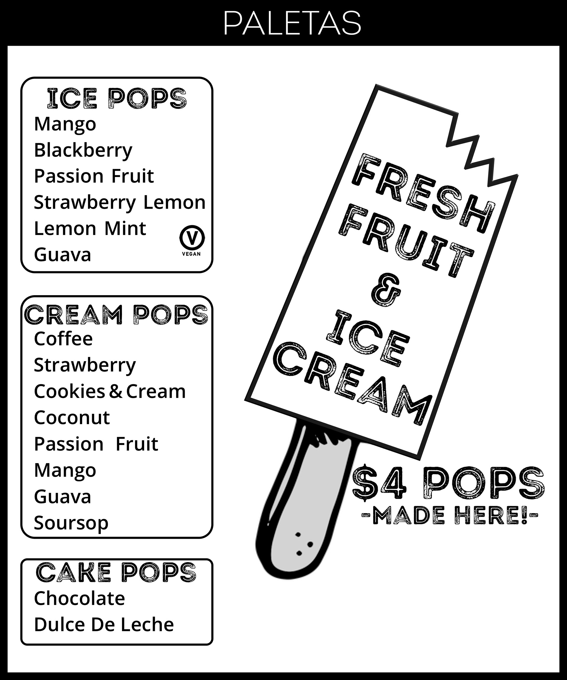
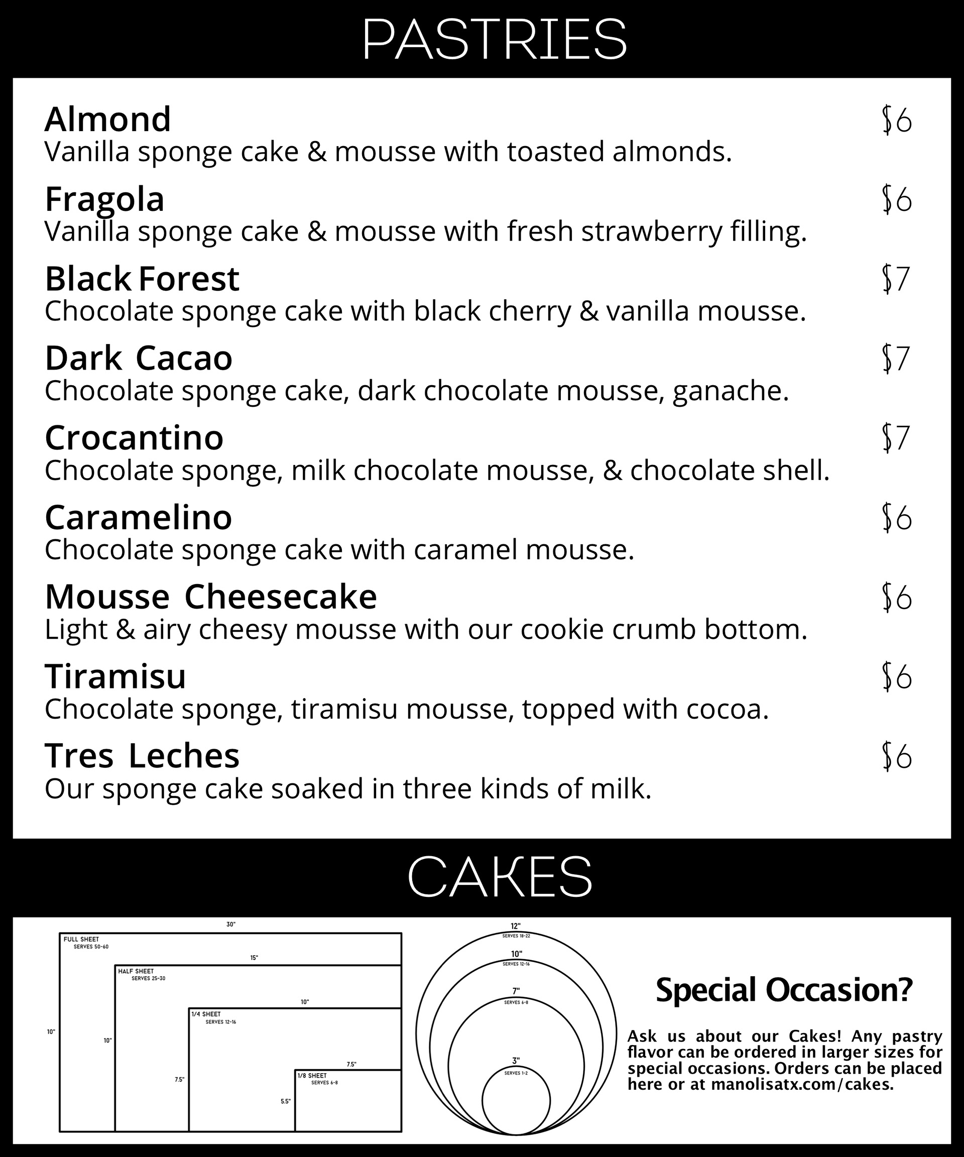
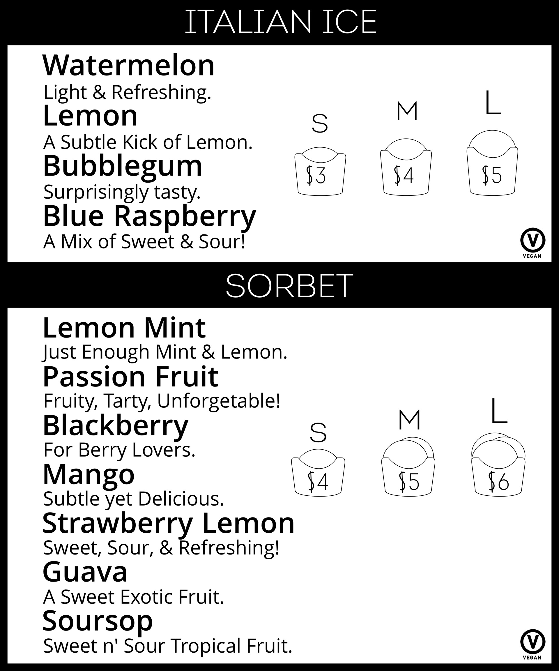
This is the updated menu in which I ended up removing the sections that allows one hand write in the boxes as seen in the previous image. This was because space was needed to fit more new items and I decided it would be best to cut that to allow for more space and larger letters for readability.
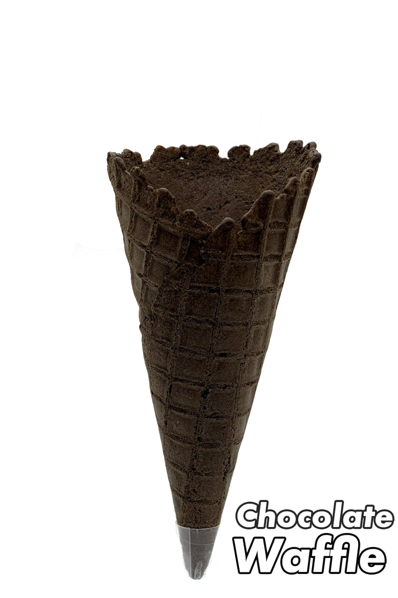
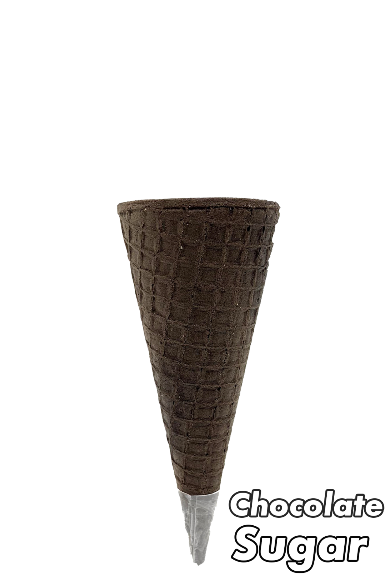
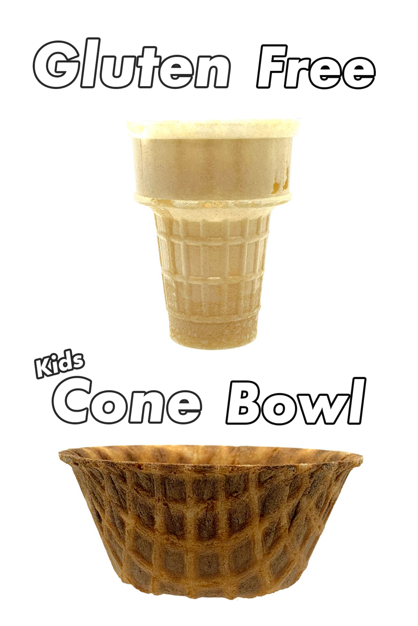

Small window signs to show the cones available for the Ice Creams.
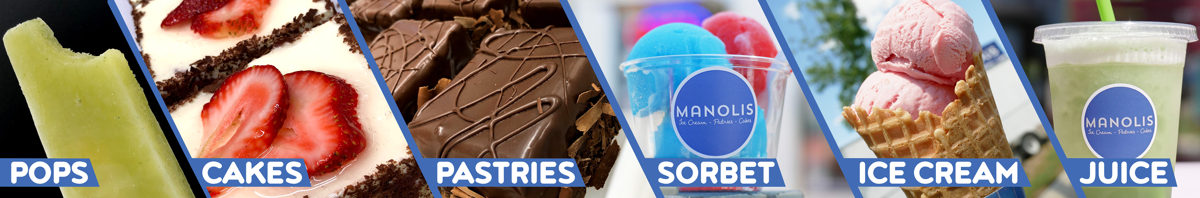
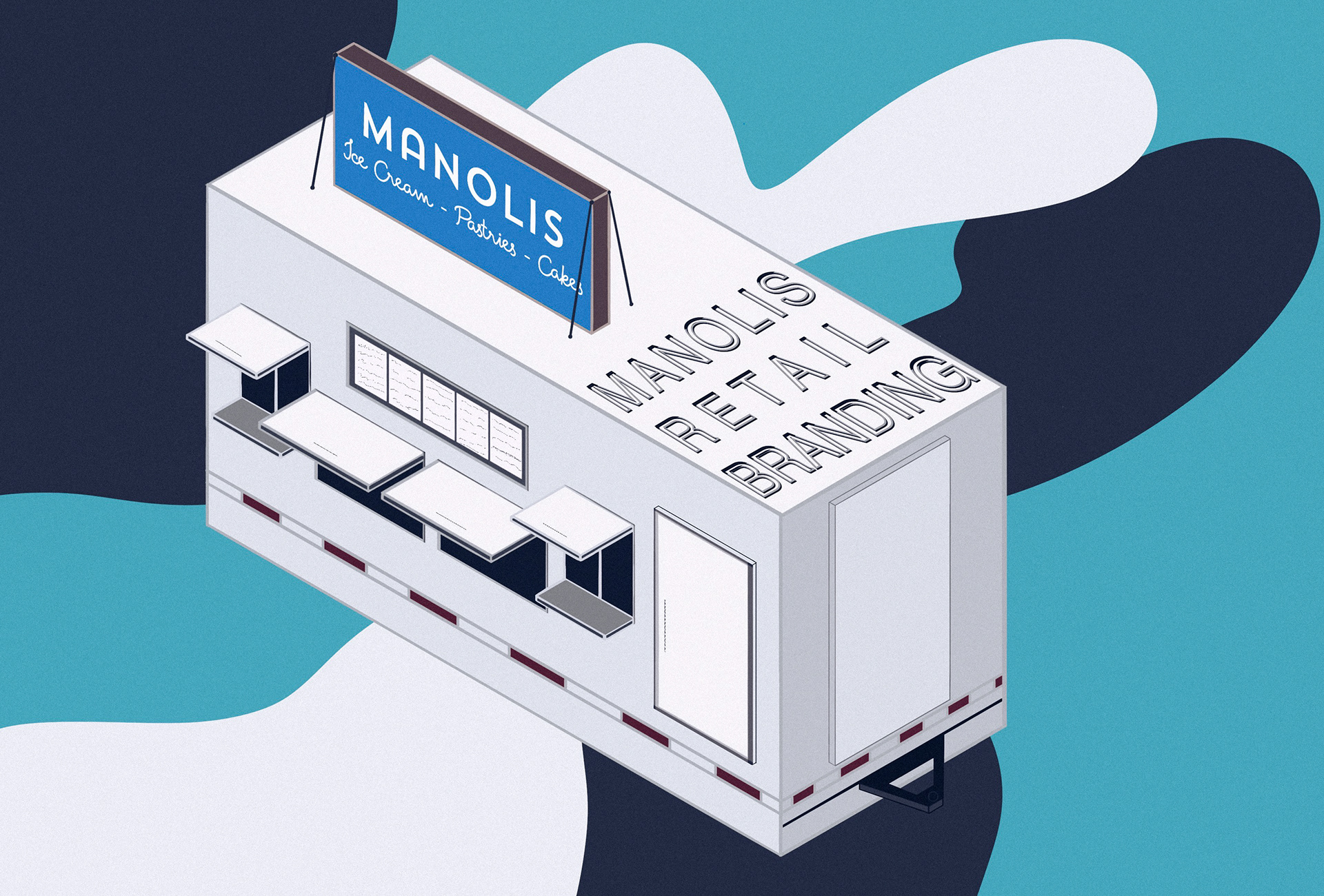
This was made to be used in the back of the truck so that cars passing by can get a quick glimpse of what is sold at the location.
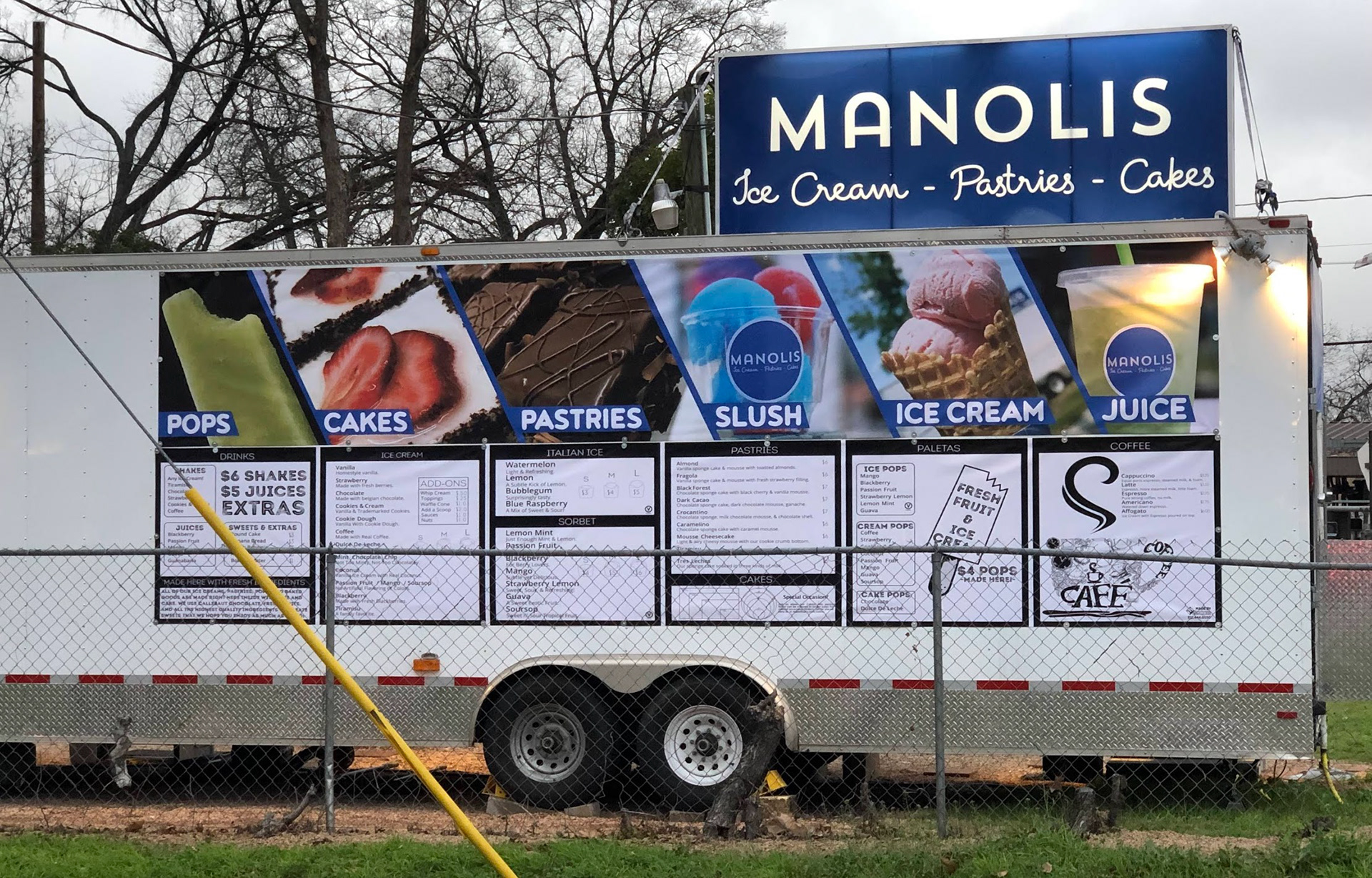
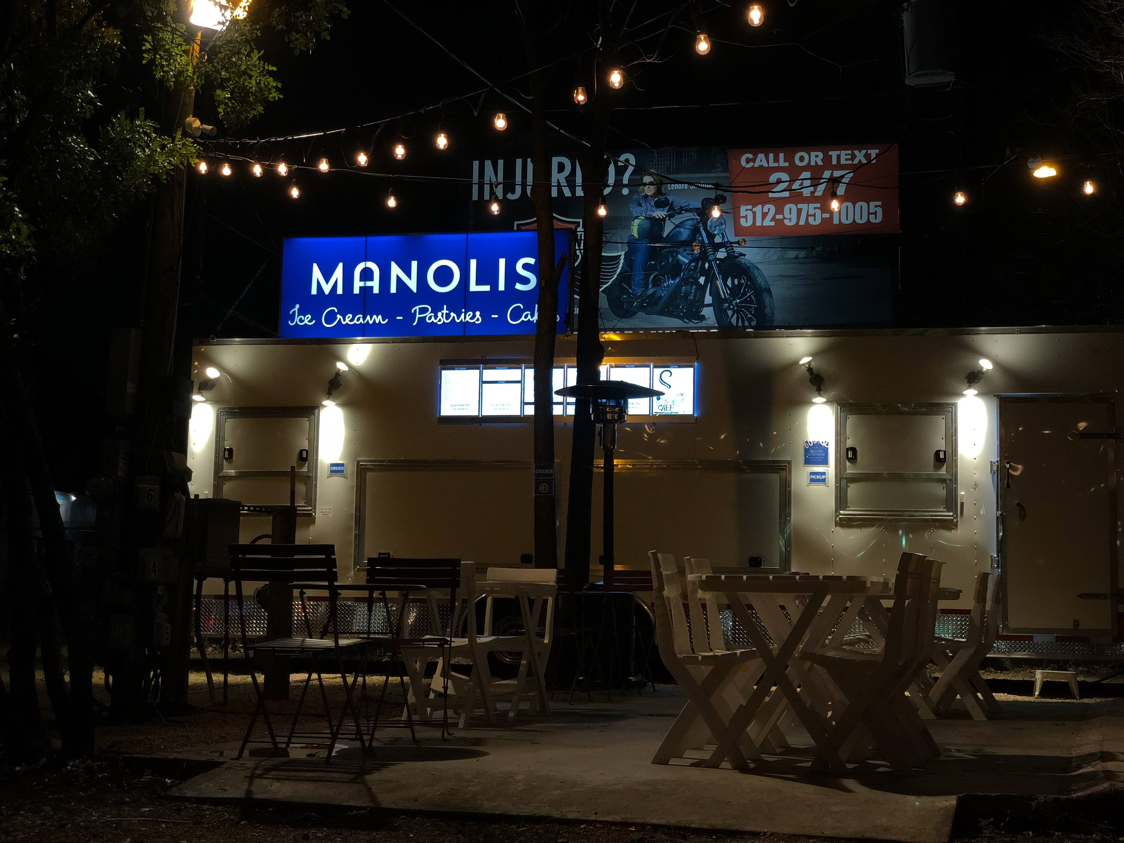
This is how the banner looks on the back of the truck. It is incredibly eye-catching and can be seen from very far down the street!
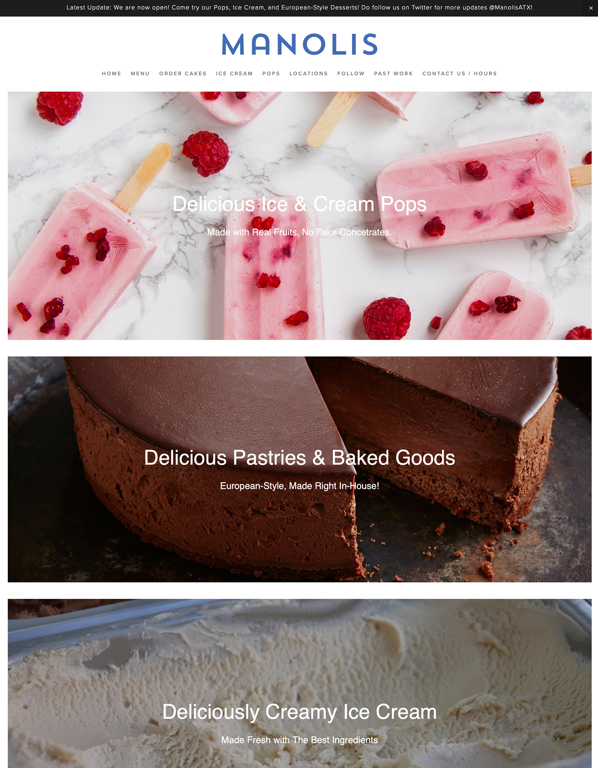
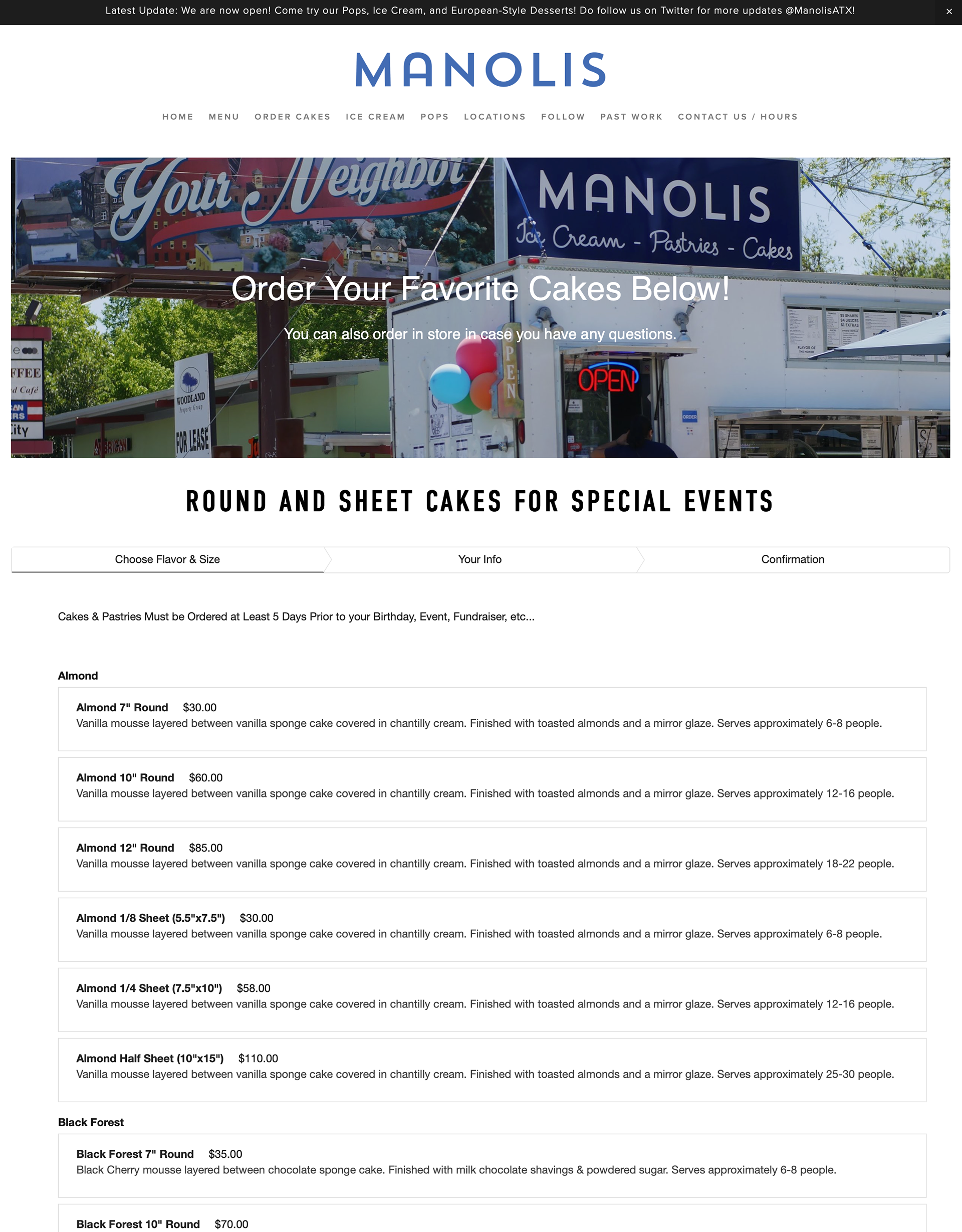
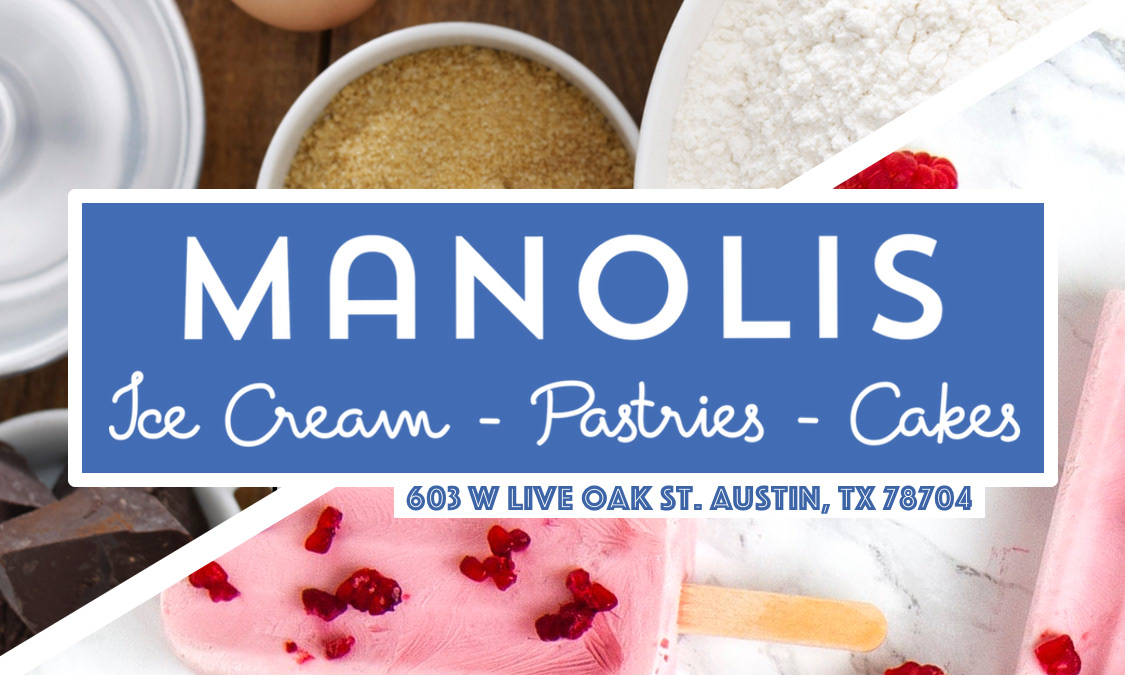
This is the website I set up for the business which uses the main logo font but flipped colors. No "Ice Cream, Pastries, & Cakes" under the Manolis name since the menu bar accomplishes nearly the same purpose while also allowing people to interact/click through.
That is all!
Since Opening, I've been in charge of all social media, customer satisfaction, and outreach campaigns. Manolis Has Been Featured in many websites and television channels, here are a few: