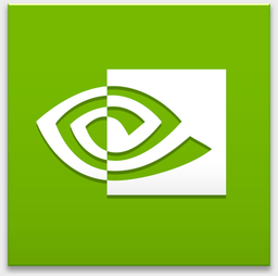
GeForce Now is a game streaming service from Nvidia available for macOS and Windows machines. I use it from time to time to run some Windows games on my MacBook but one thing that has bothered me is the icon they have on macOS.
This is how the current GeForce Now App icon looks on the macOS dock. Nvidia uses the same icon across the Windows and macOS clients but this square design icon didn't really match with the other apps on my dock. On Windows 10 the icon looks great since it matches the UI perfectly. On macOS... there aren't really many squared icons aside from the Adobe suite.
I went with a round style icon to match the AppStore, Safari, and Spark. I took the color palette that Nvidia uses in the Geforce Now UI. I feel that it now has more of a gaming vibe while also matching the rest of my dock.The green/gray palette make it pop and make impossible to mistake it for any other app on macOS.


On the left is the old icon and the new one is on the right! I experimented with different sizes on the green outline and this ended up looking the best when placed on the dock. Feel free to drag the icon to your desktop and apply it to your GeForce Now app on macOS!
